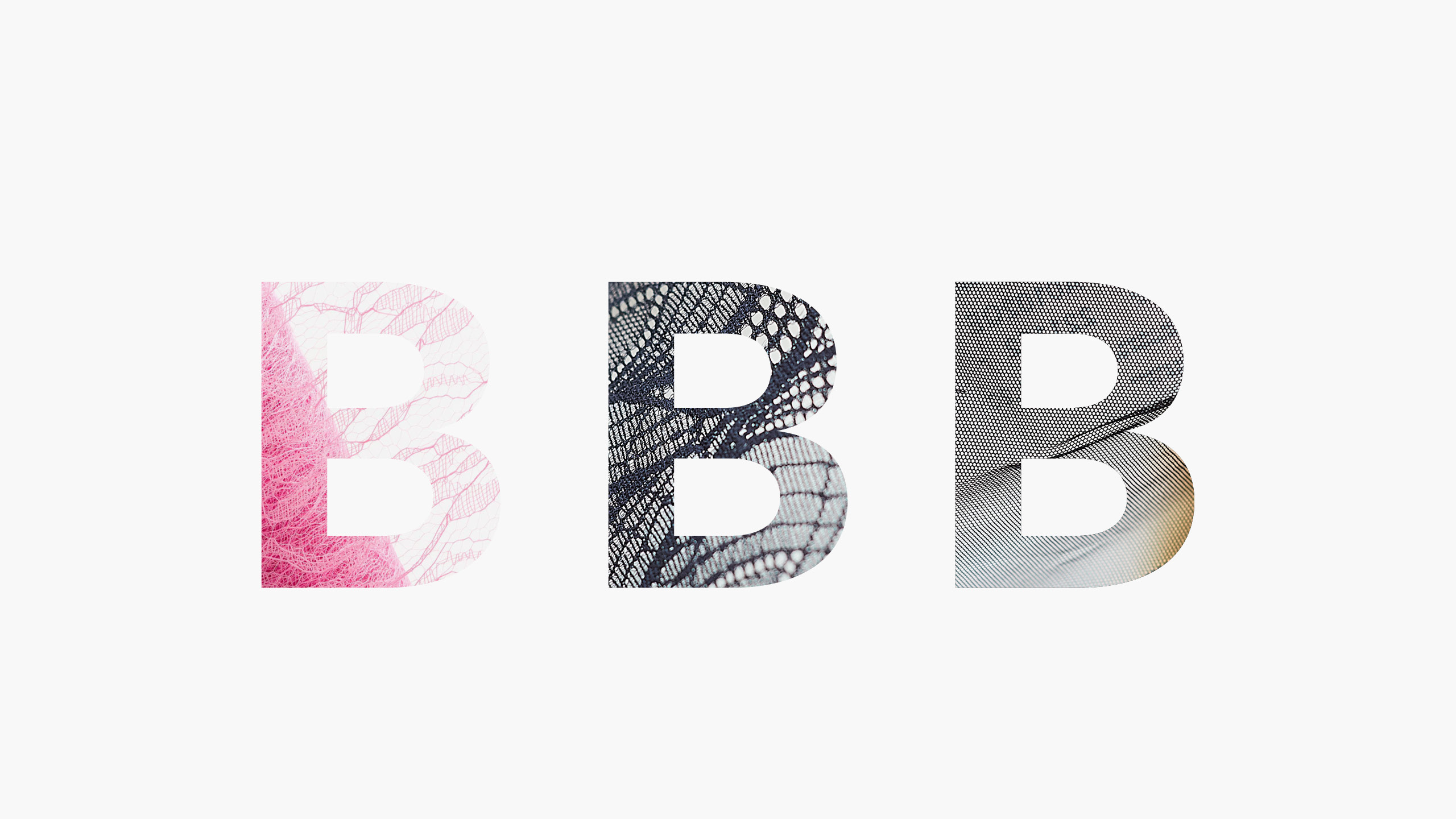
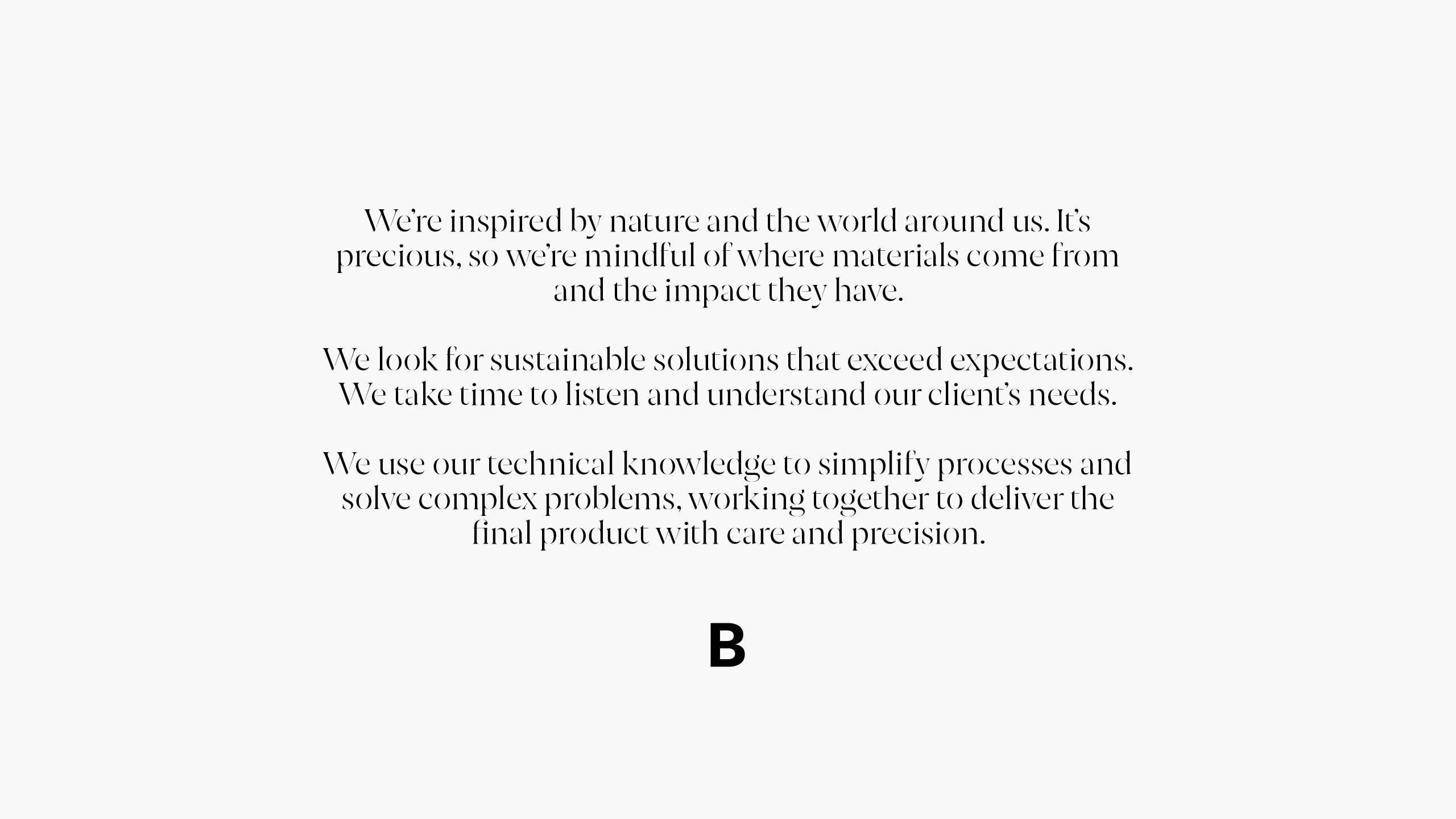
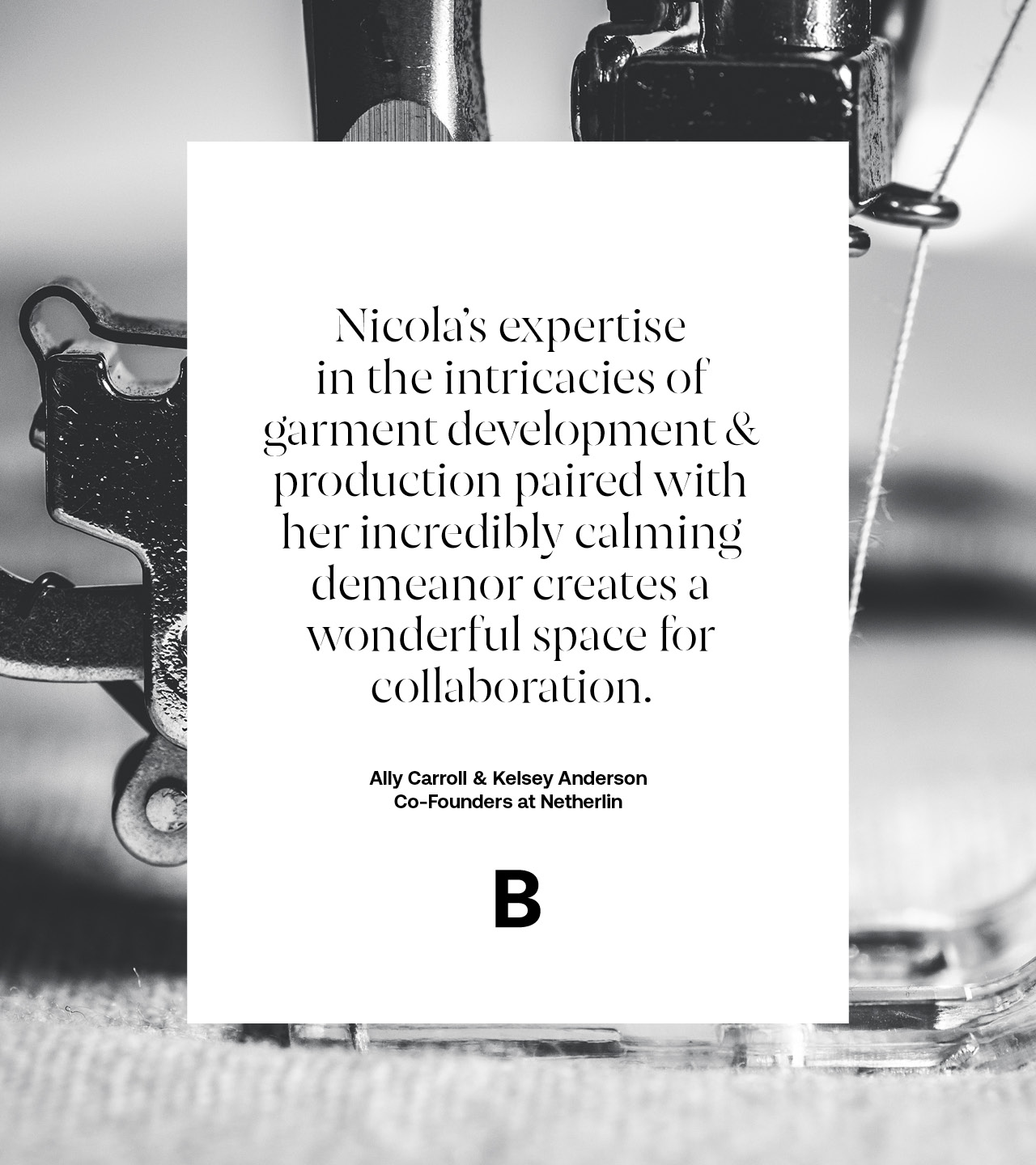
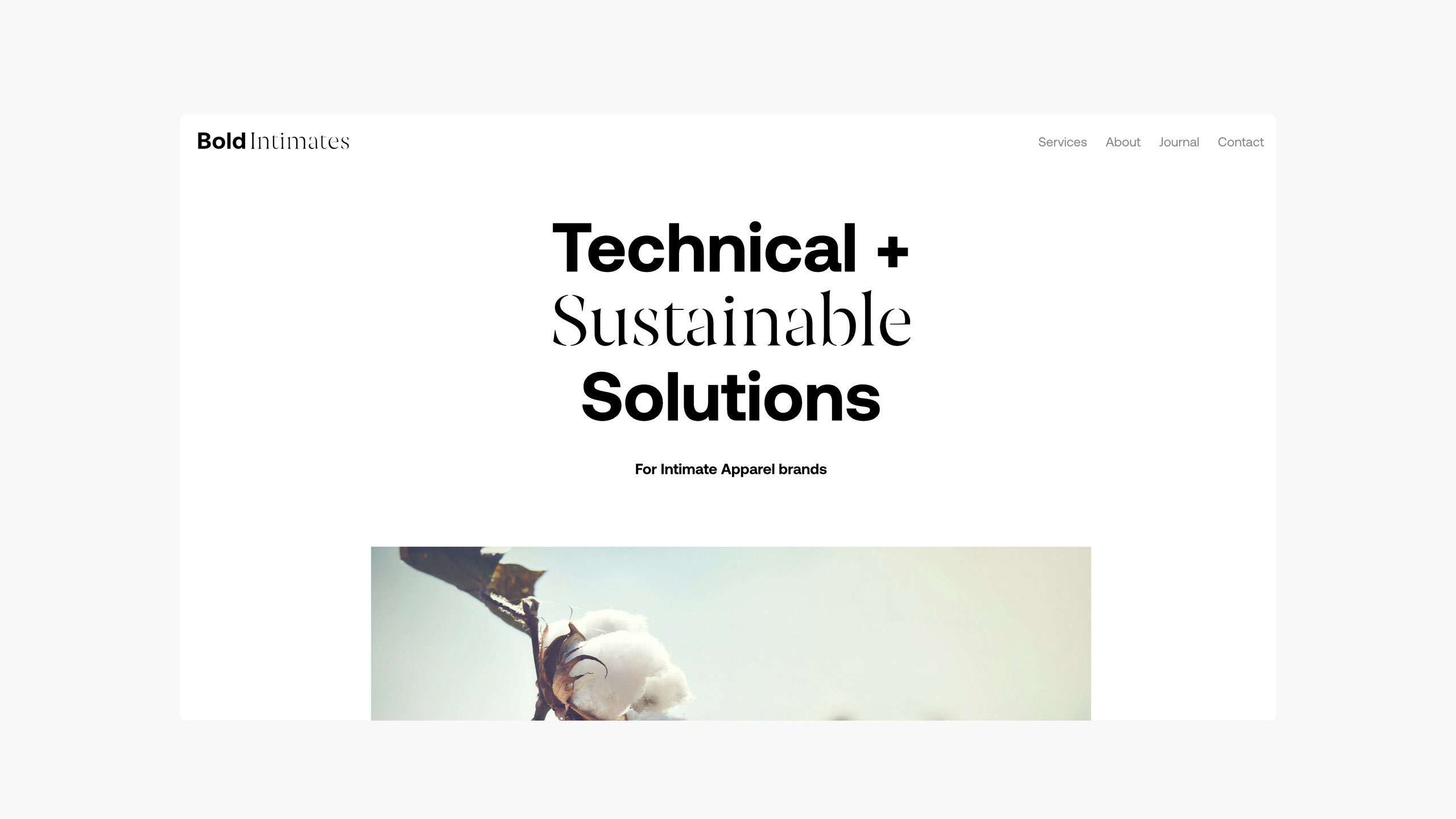
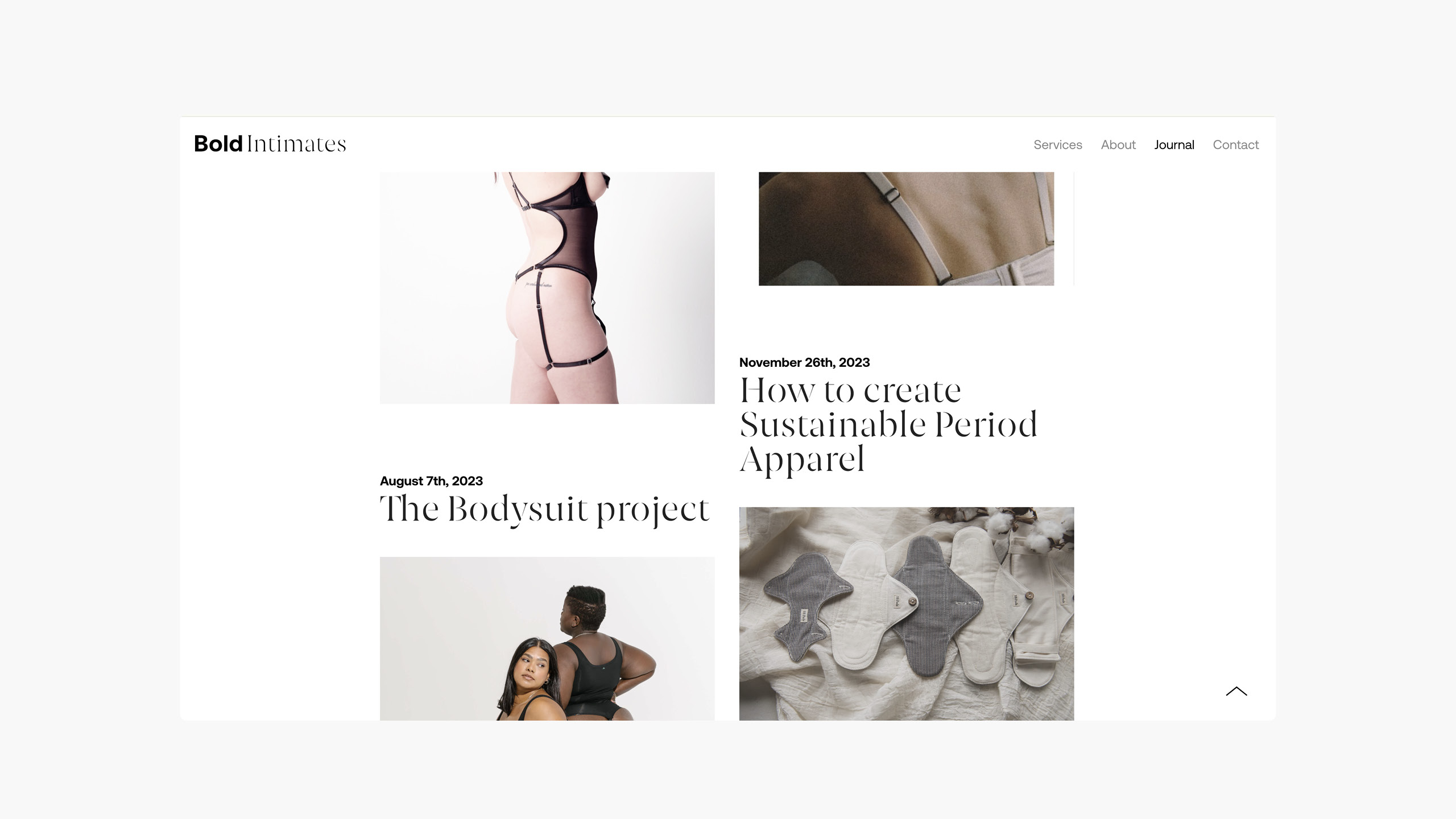
For this lingerie and apparel consultancy, the natural world plays a key part in their beliefs - both from a responsibility aspect to a more spiritual connection from the materials we wear. Technical accuracy and innovation is at the core of their skillset and to apply that using integrity, authenticity and transparency.
CONTEXT
Initial research we carried out uncovered the powerful therapeutic effects of sound on both mind and body, its arrangement and the transformational effects of specific frequencies. Music at 528hz for instance markedly reduces cortisol and increase oxytocin, whilst different sounds, arrangements and frequencies produce different effects.
The idea
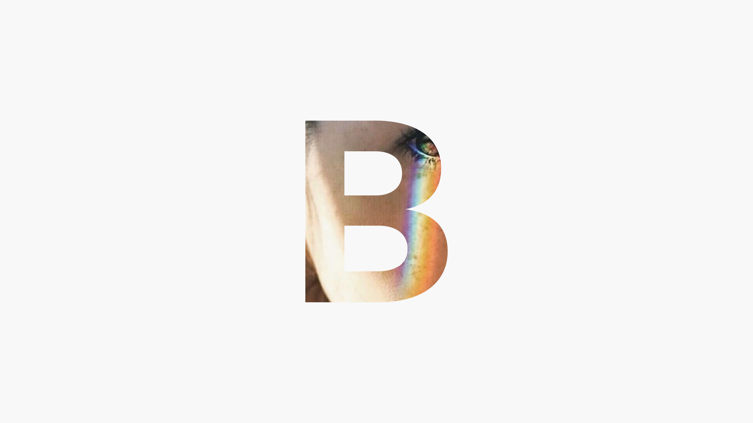
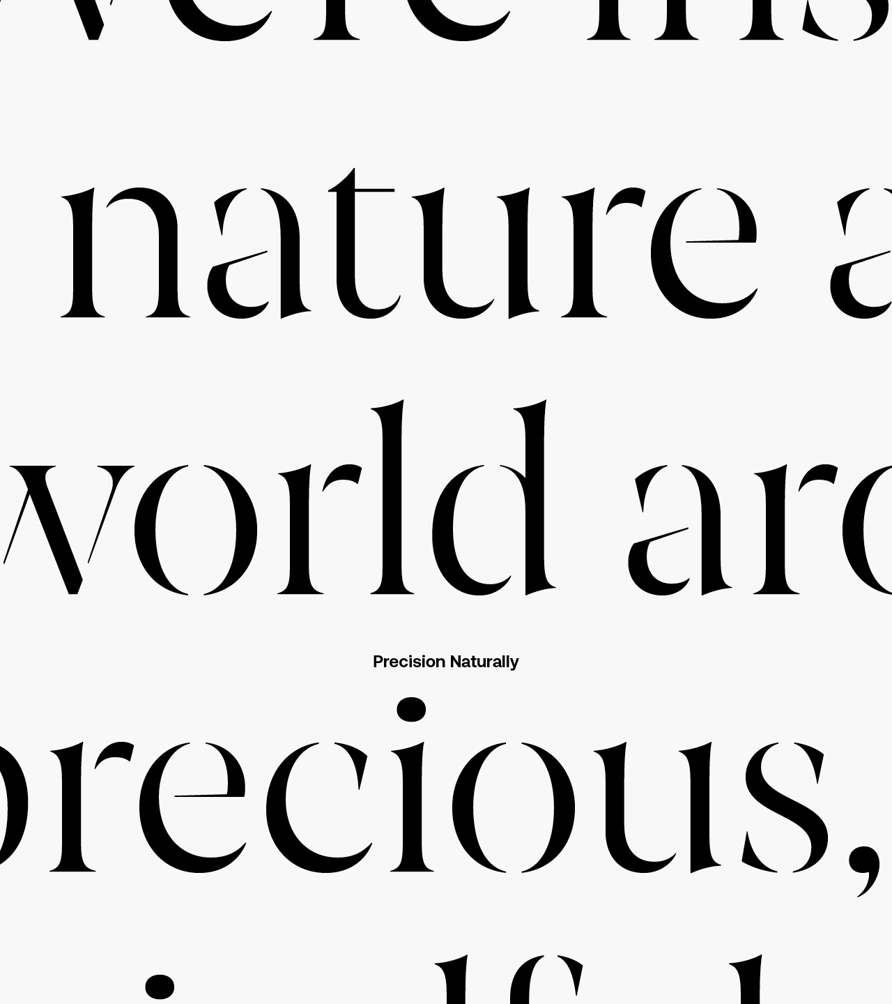
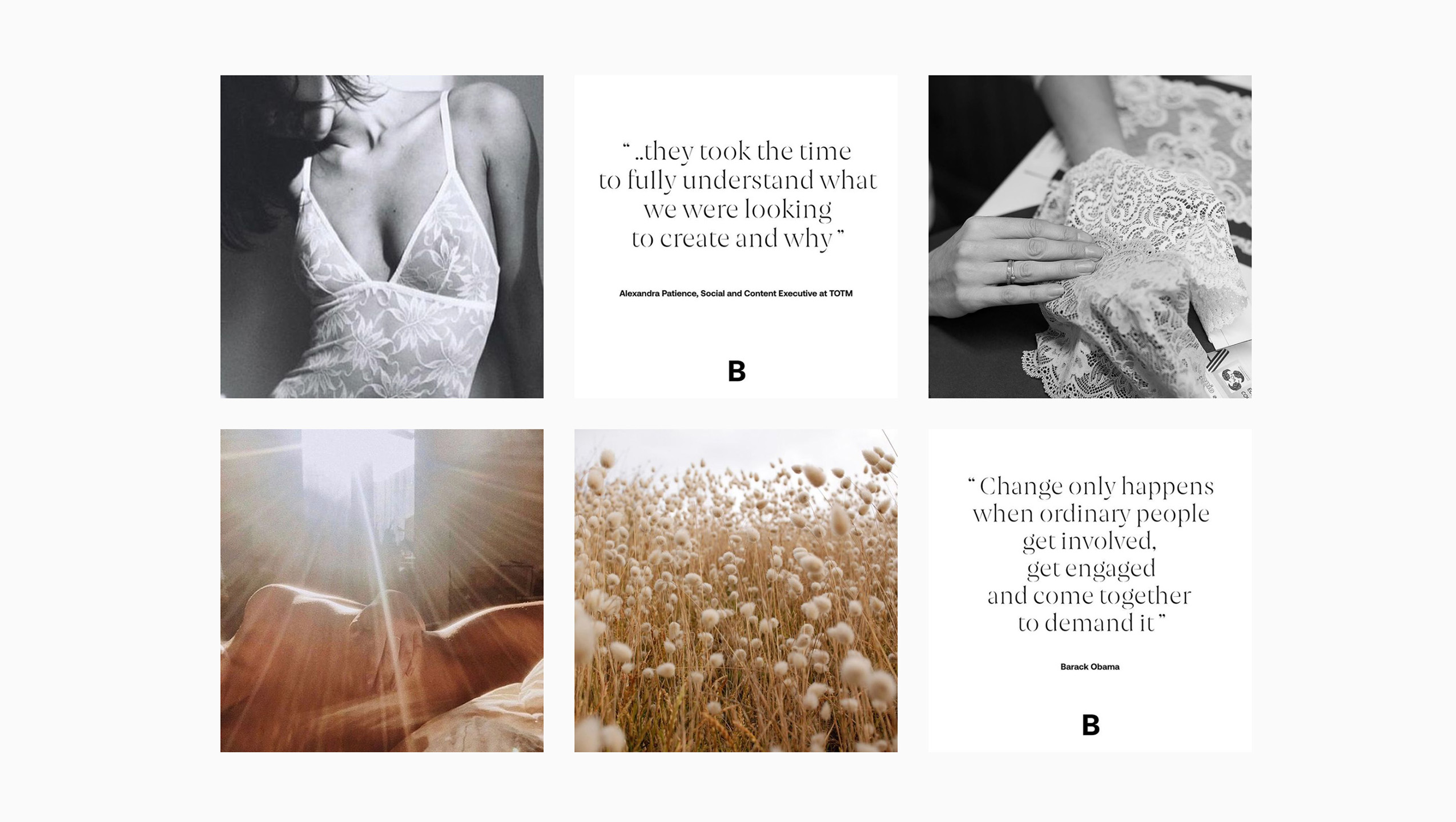
This was distilled down to a core idea which embraces the duality of the business, 'Precision Naturally', which carries the duality present in the name itself. The two sides of their voice became the base for a typographically led identity that embraced both a boldness alongside a more natural, softer side represented through a stencil font which subtly references the form cutters used. This created a tension that acts as a sprinboard for conversations around industry, consumer and envronment.



"I could not recommend working with Robin more highly. So far, he has breathed life into three brands within our group portfolio. He is quick to assimilate a vast amount of strategic information, and has the creativity to visualise this into something beautiful and elegant. His professionalism means he is dependable and reliable, which is a significant contributing factor to why we have used him for every piece of major brand work in our Group since finding him."
Freddie Moross
Myndstream, Founder