Ella Bull
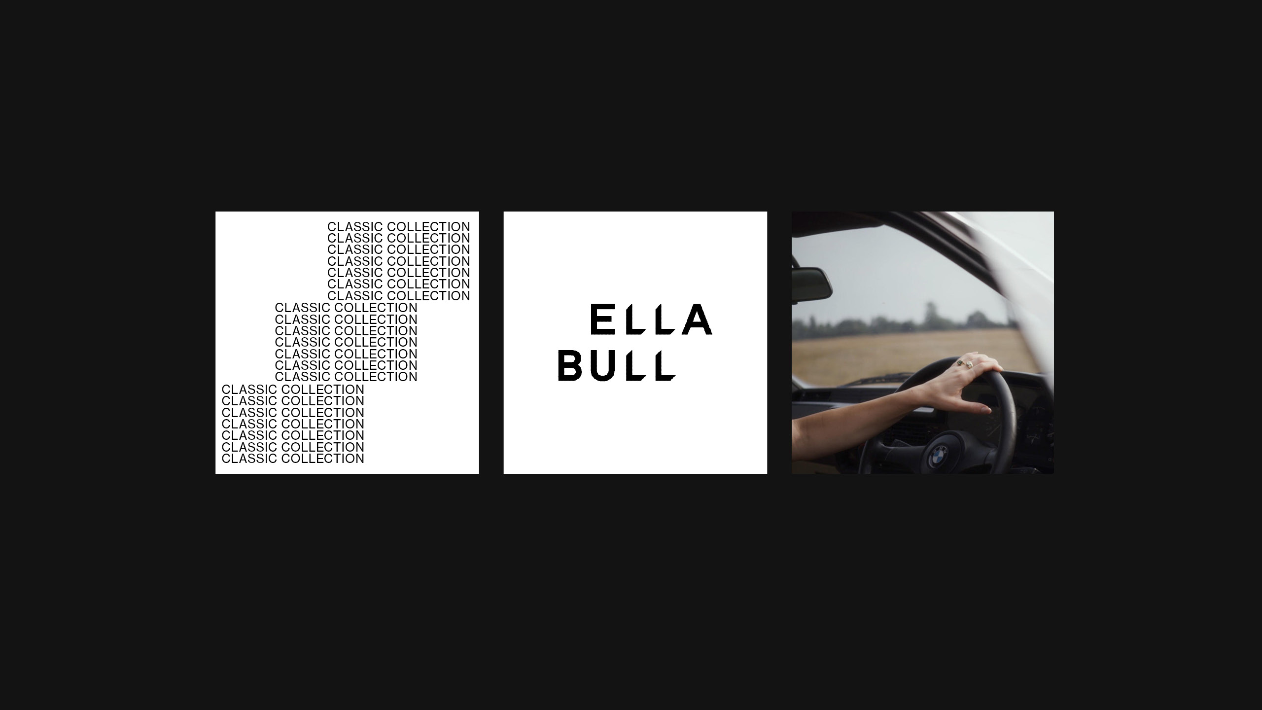
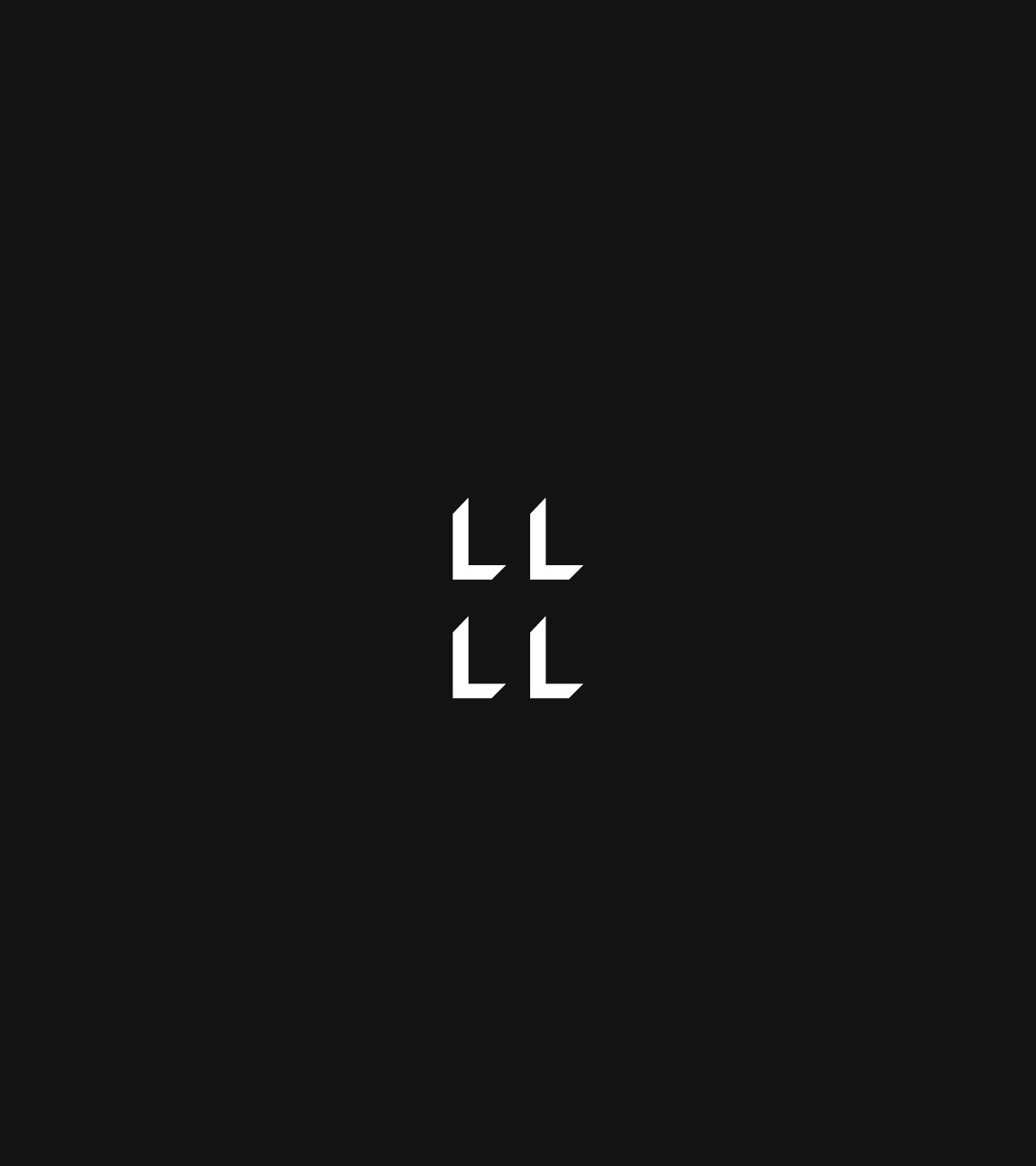
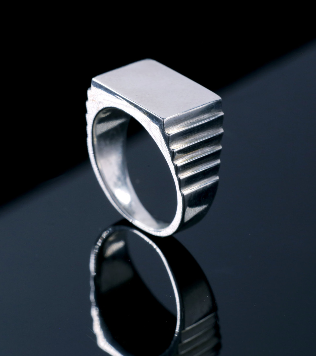
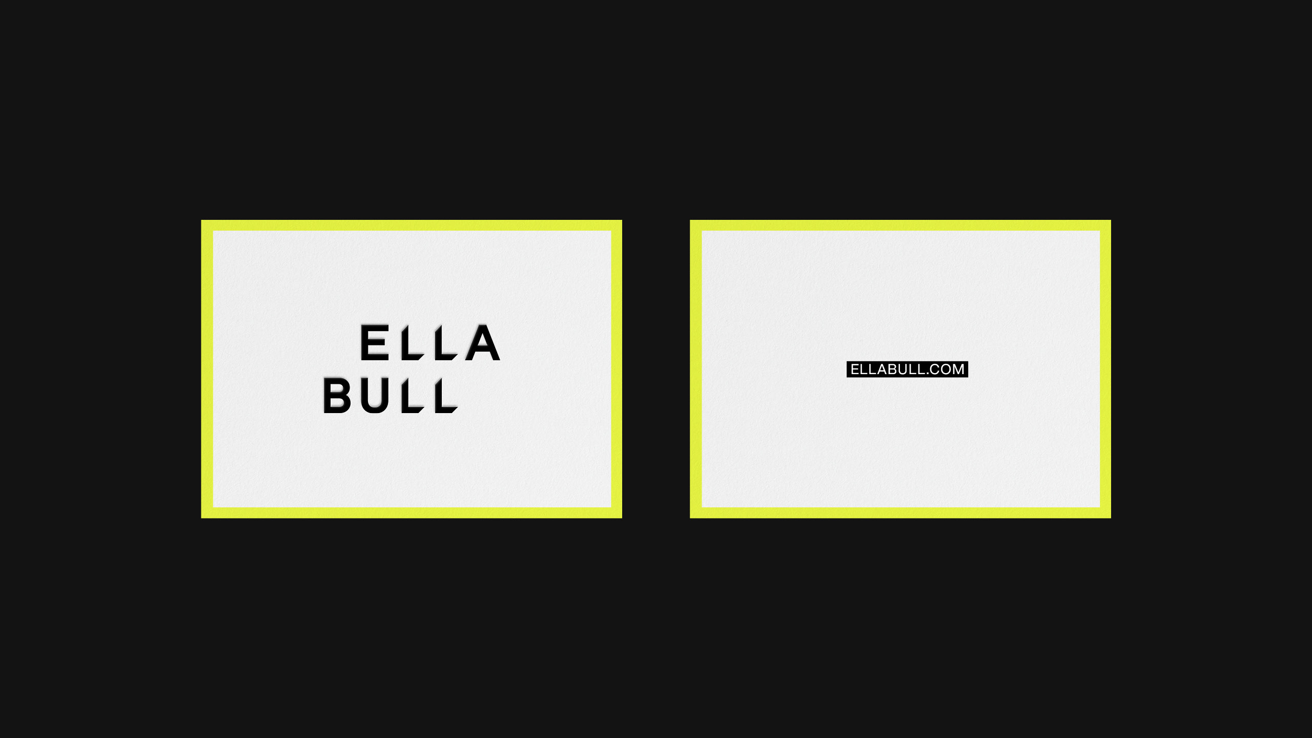
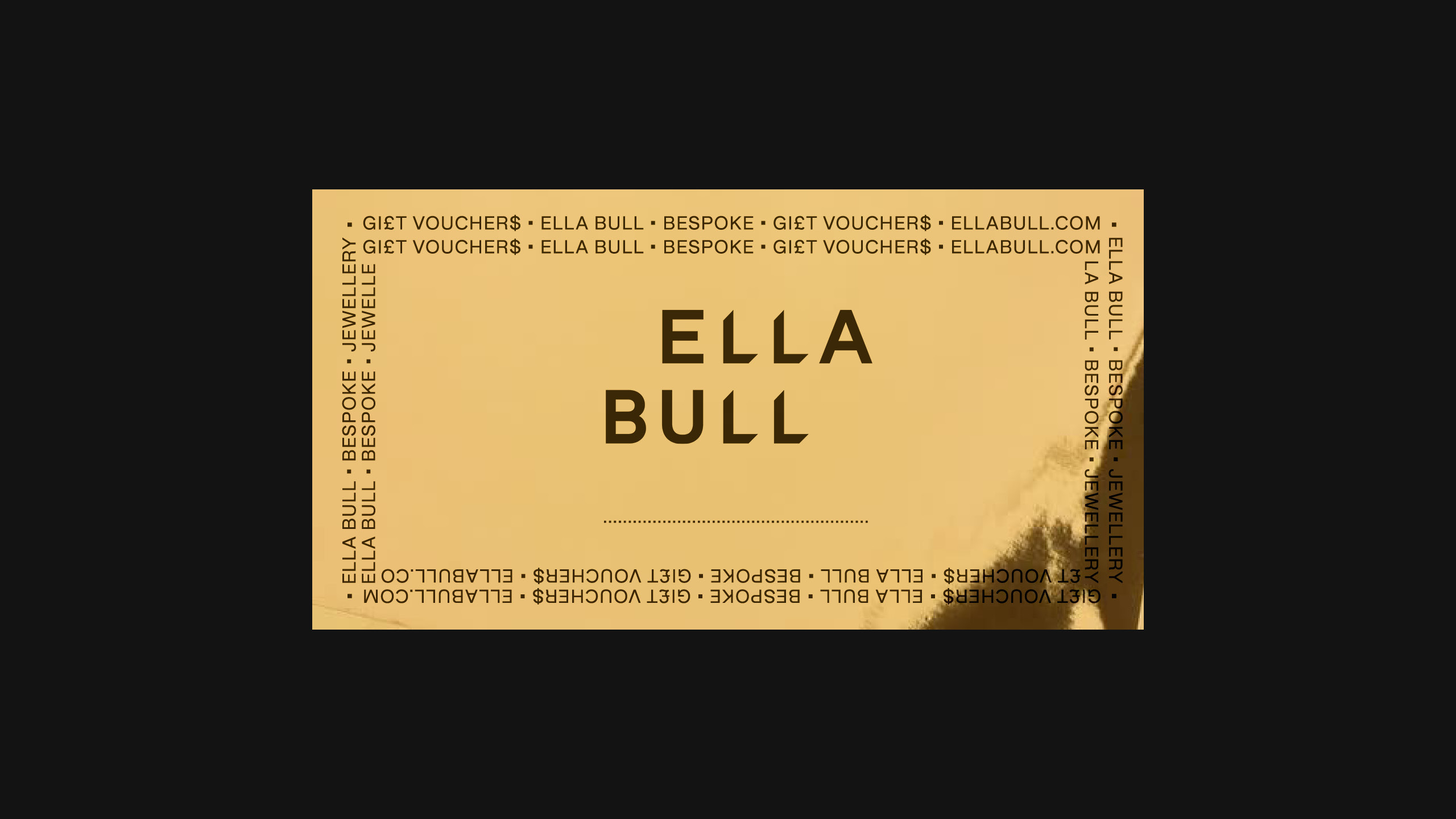
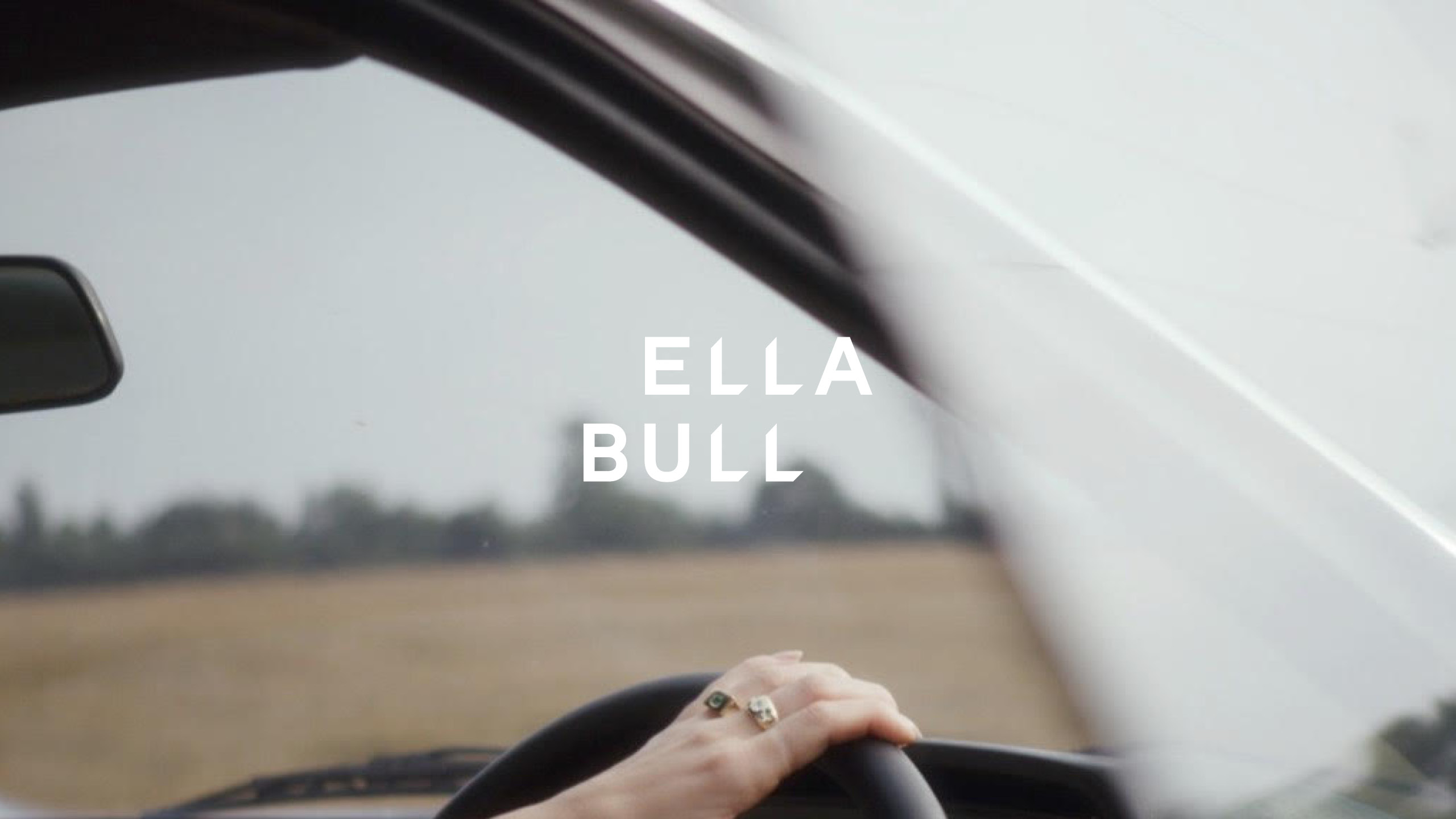
A London jeweller with rising reputation for making boldly simple bespoke pieces and modern takes on the classic signet ring. Subversively simple jewellery. A promise that helps positions her work as playfully different — a bold simplicity. A suitably bold wordmark sits at the heart of the identity with cuts that feels like it's been stamped or extruded, playing with depth and plane. Stacked and off-set the wordmark aligns the four L's in the name to create a jewellers mark. Repetitive and stacked type forms a playful visual language reminiscant of concrete poetry. Highlighted text and key bright yellow key colour are a nod to punks visual language that helps give a rebellious spirit to the identity. Campaign photography shot by Shaun James Grant.