Bringing audiences and young talent closer to drama
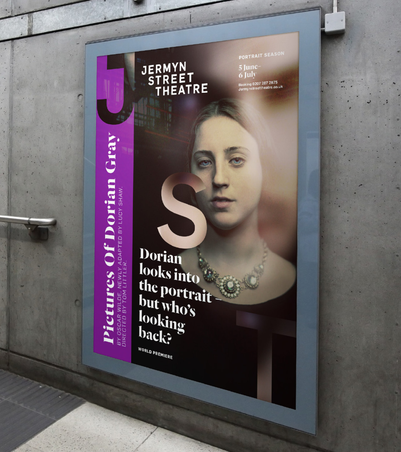
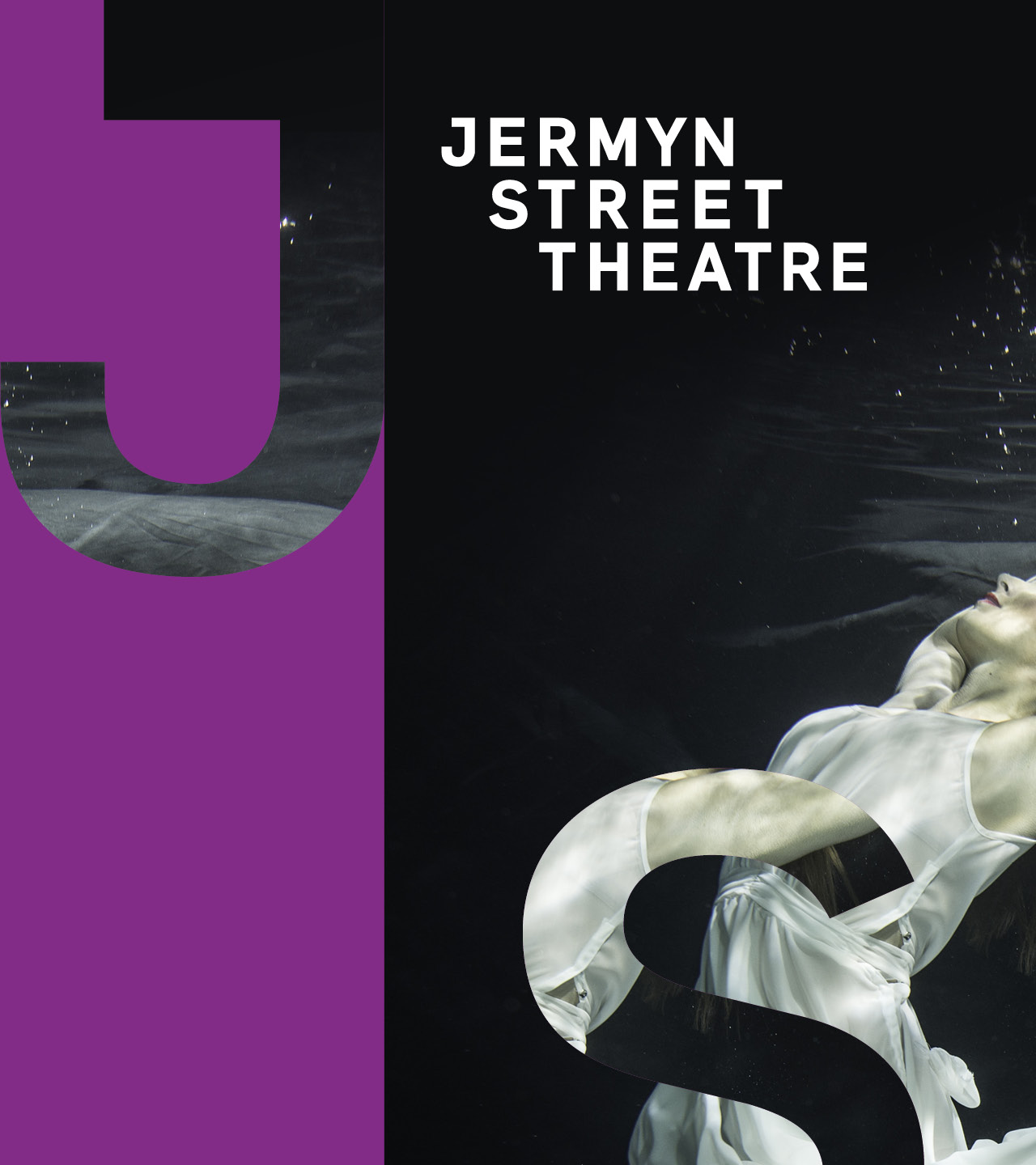
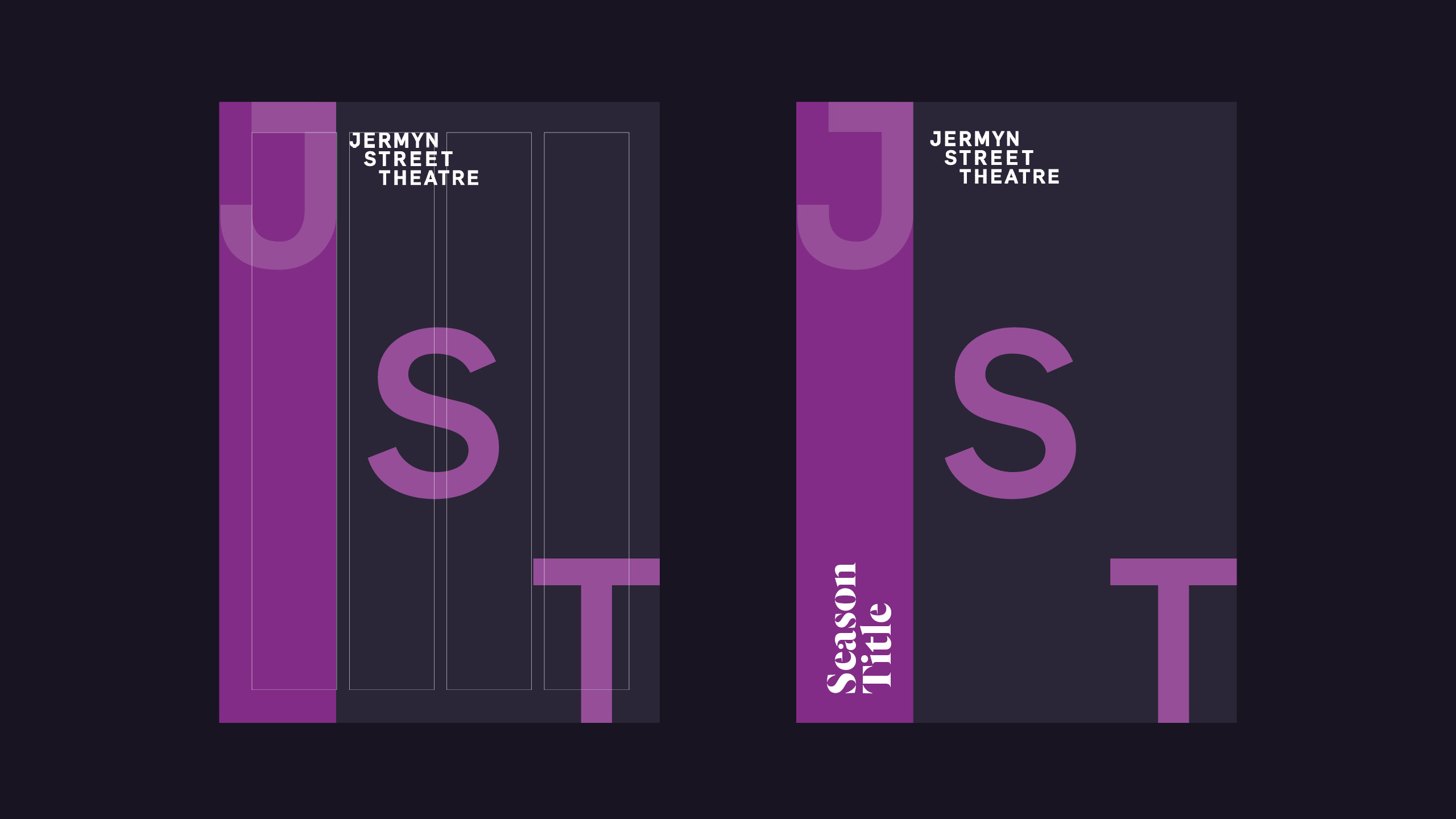
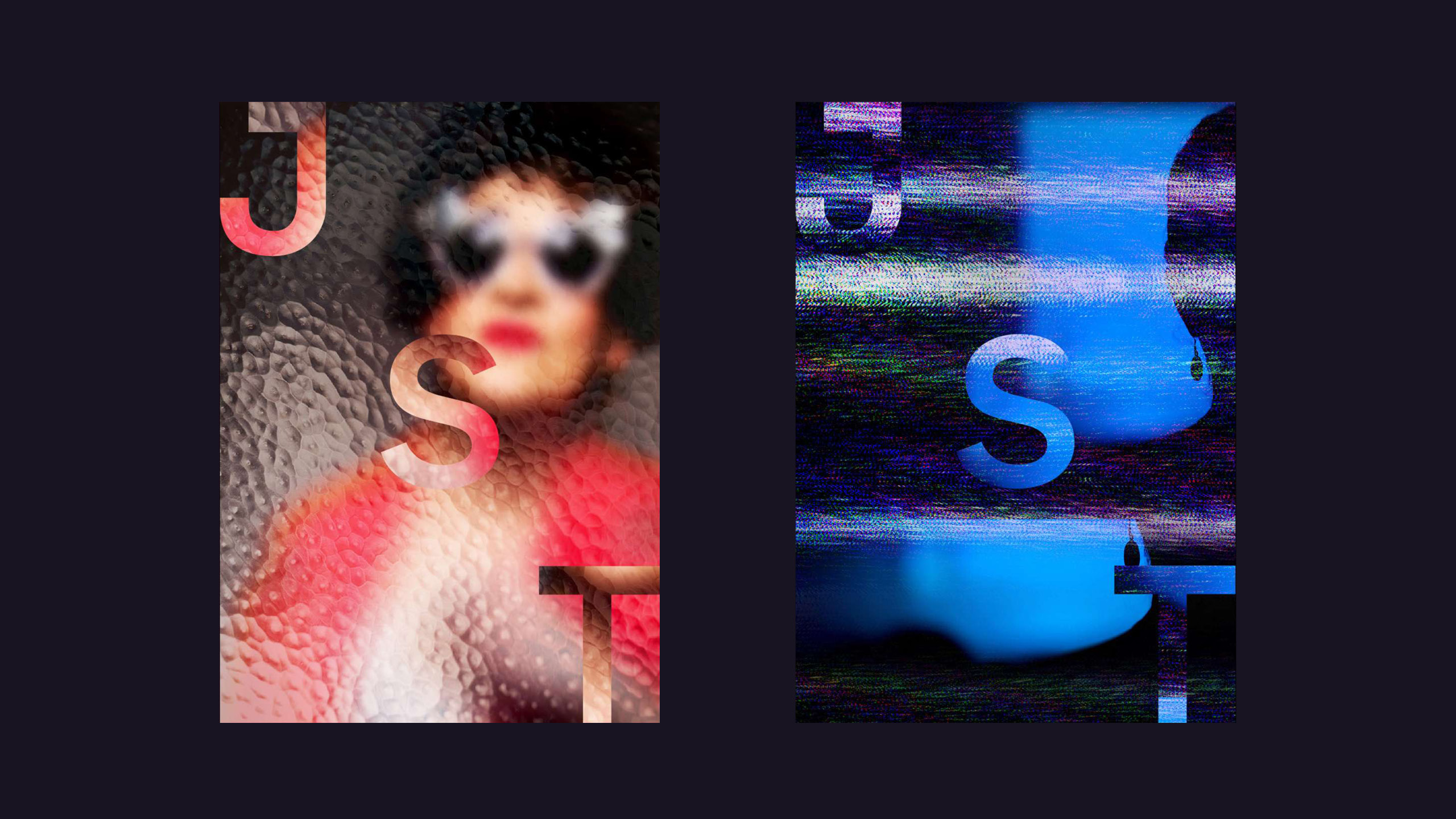
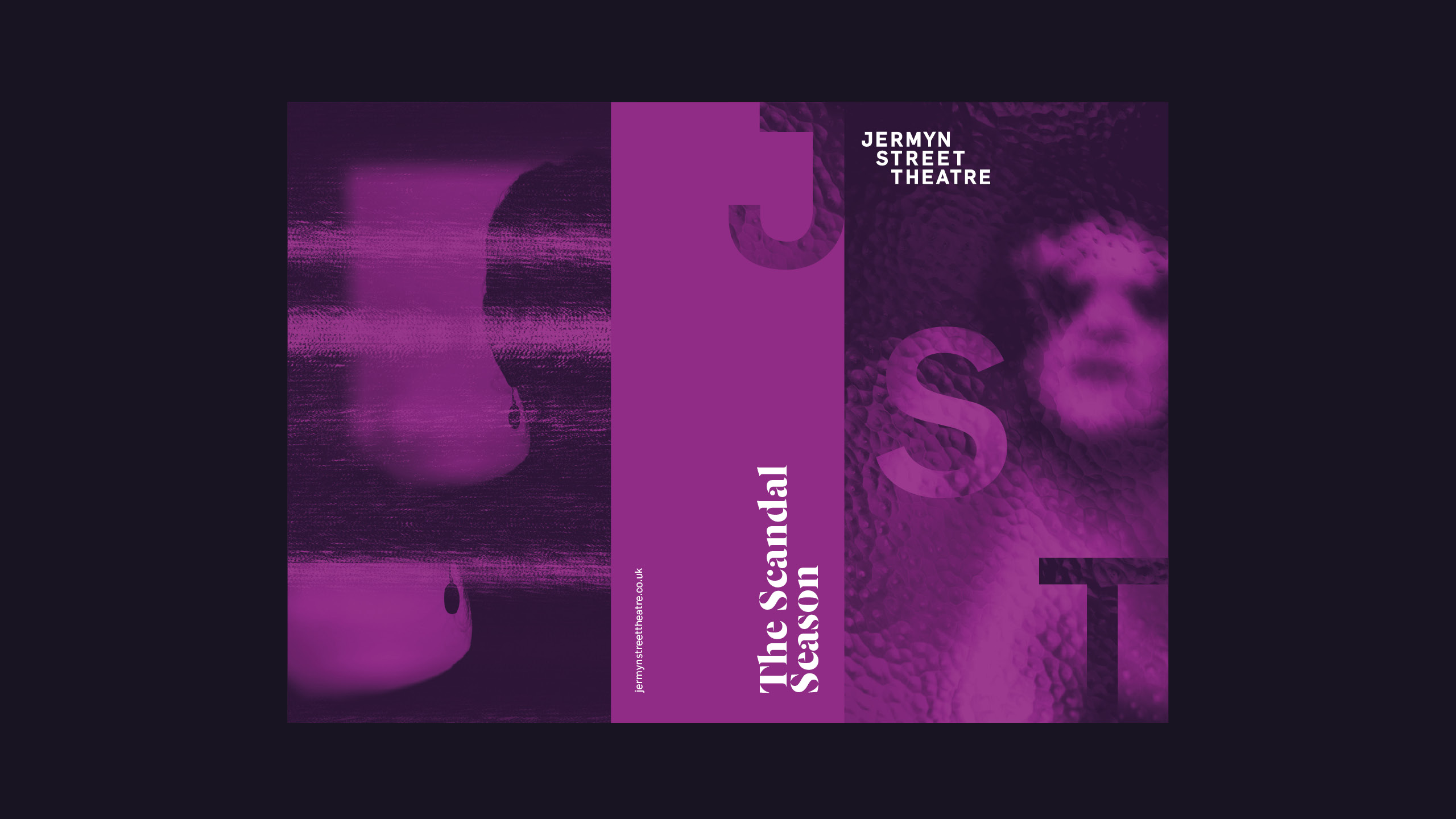
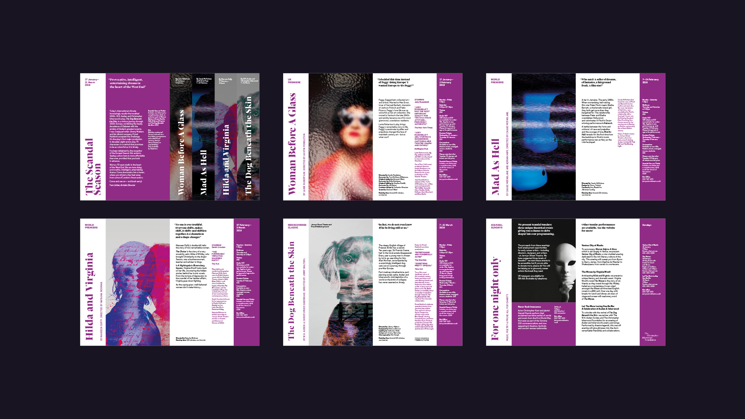
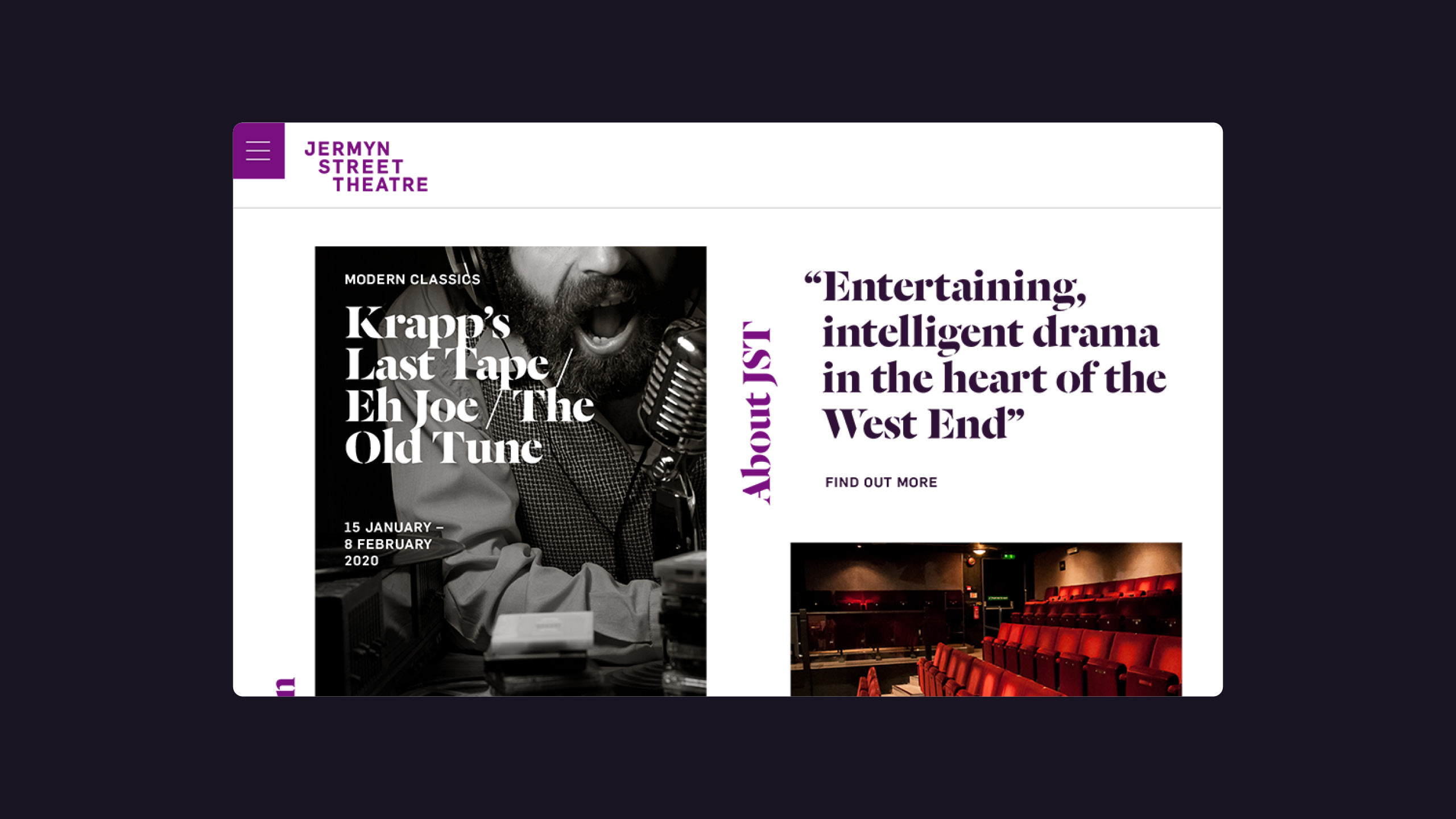
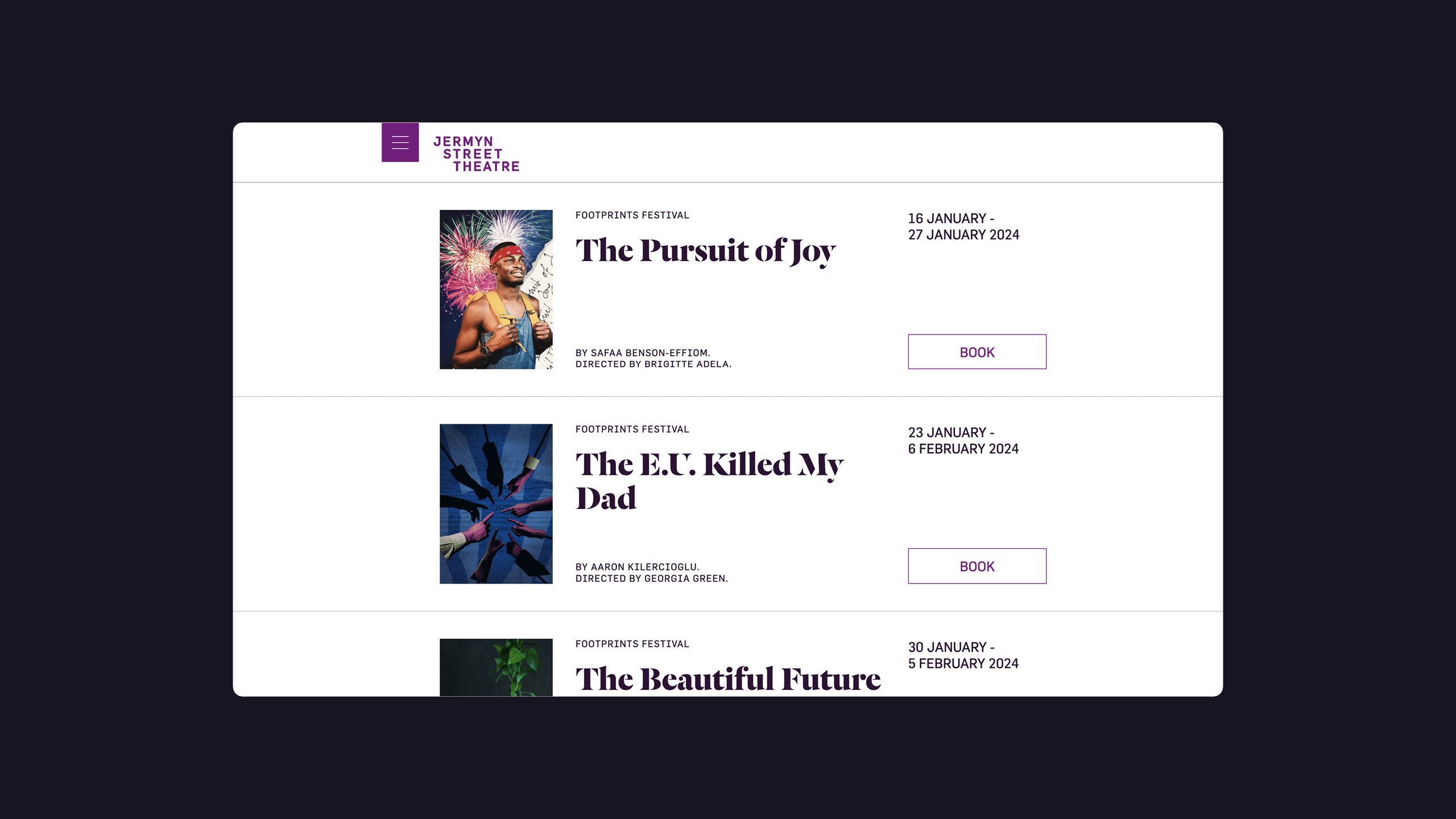
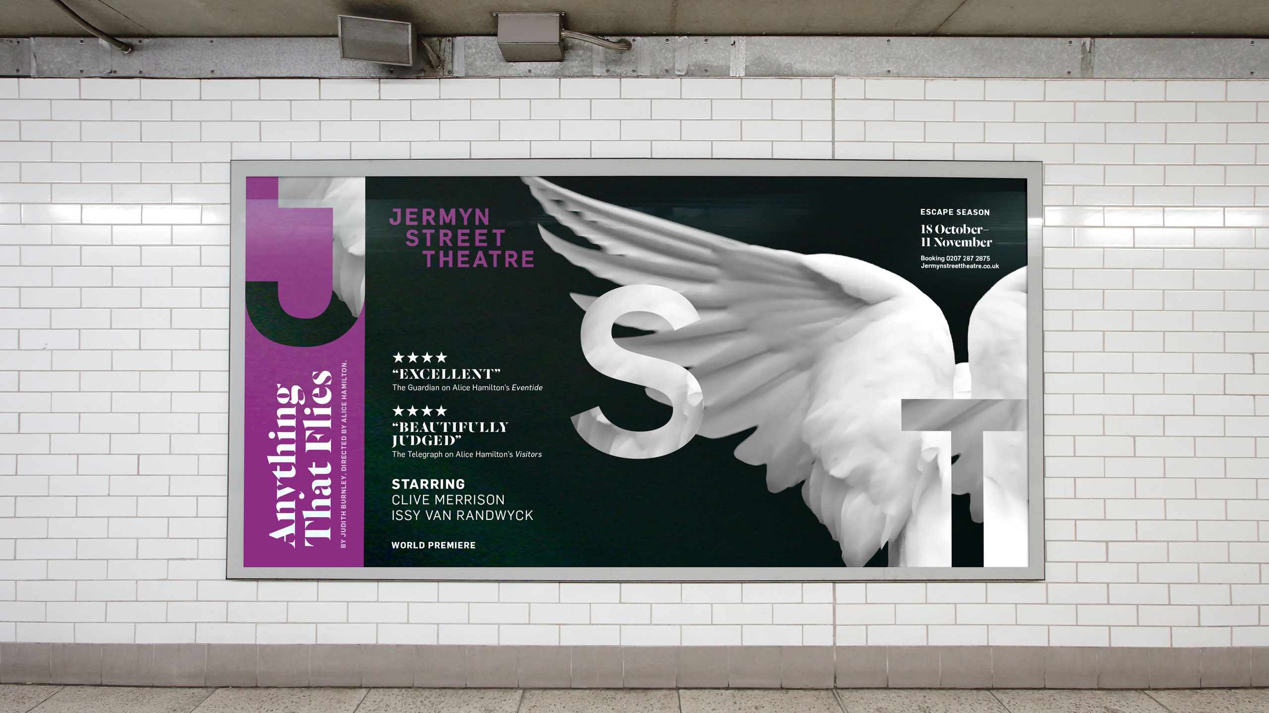
Jermyn Street Theatre is the West-End’s most initimate theatre. With a shift over to becoming a producing theatre they needed a new brand identity to reflect this change in direction. Descending the stairs to the intimate basement is part of the theatre’s charm. It's intimate size makes it a favourite amongst actors and audiences alike. A new brand idea ‘Closer to Drama’ enabled them to clearly communicate the benefit of a more visceral experience as well as the work they do in supporting the next generation of directors and producers. Using this, we developed a stepped custom wordmark, designed to build a sense of drama - leading the audience down to the stage in the theatre below. In purple we found a colour that they could own in the crowded theatre space, making it instantly recognisable. Creating a shorthand for the theatre, the oversized JST characters that step diagonally anchor to the edges of the page. The confined usage references the sense of intimacy audiences experience. Cropping sections of the image into the characters created a sense of drama while a glass effect magnified the image where it overlapped. The Display font Dala Floda brings sophistication and added drama to contrast against the simpler support font. For the initial season we created the production imagery for each show before handing over to internal teams. Images were deliberatley closely cropped to bring the viewer into the scene, replicating. the intimacy of the experience.