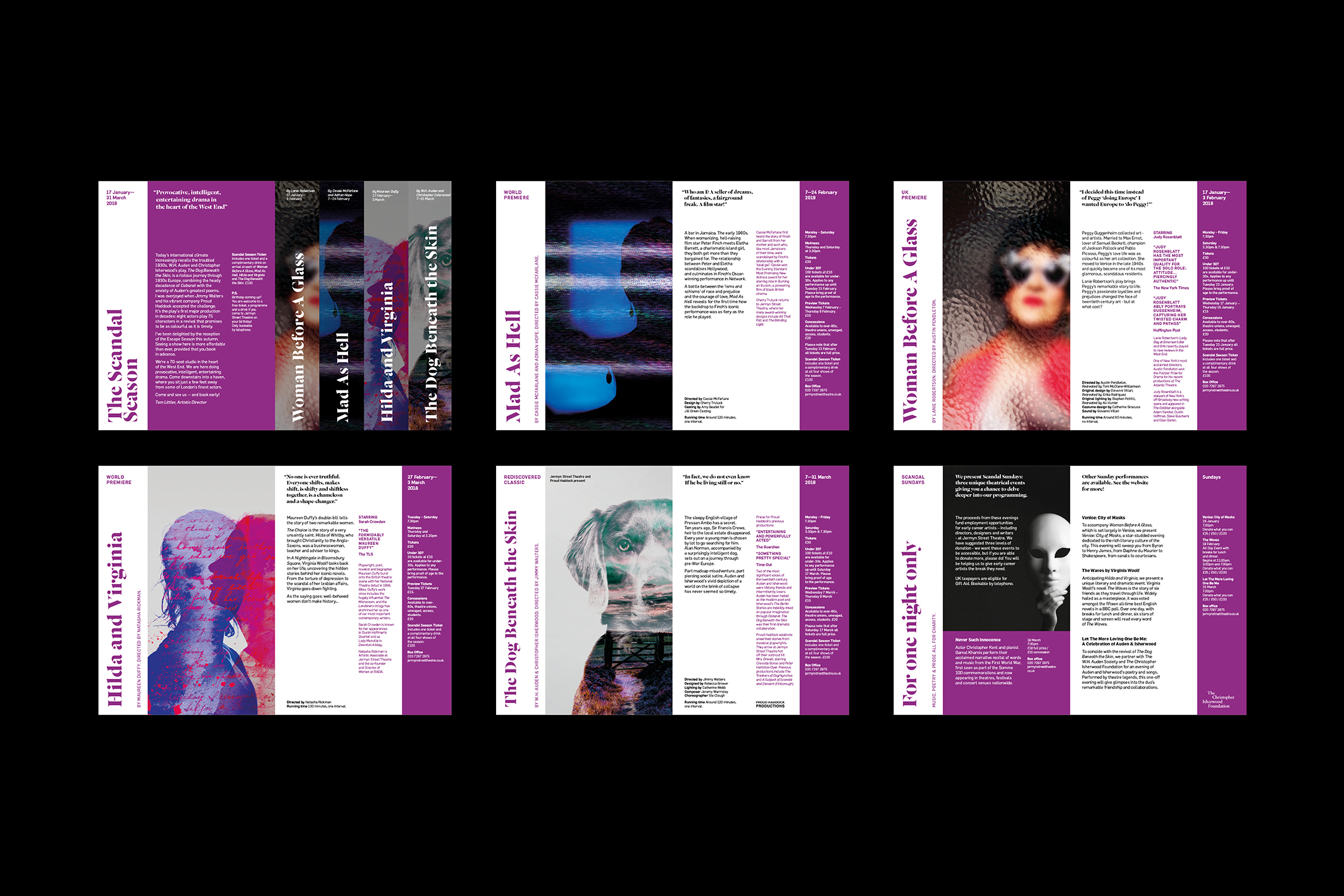
JST is the West-End’s smallest basement theatre. With a shift over to becoming a producing theatre they needed a new brand identity to reflect this change in direction. Descending the stairs to the intimate basement is part of the theatre’s charm.
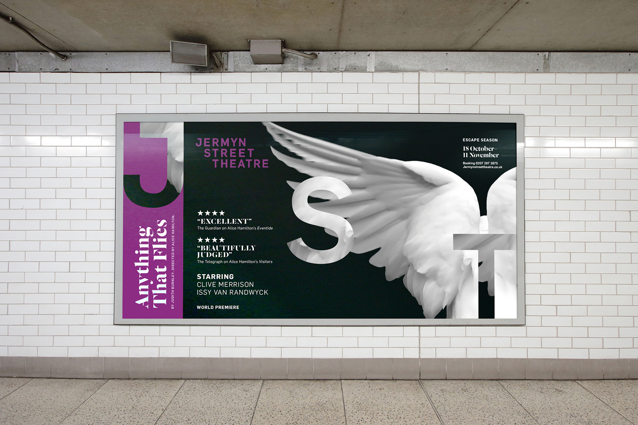
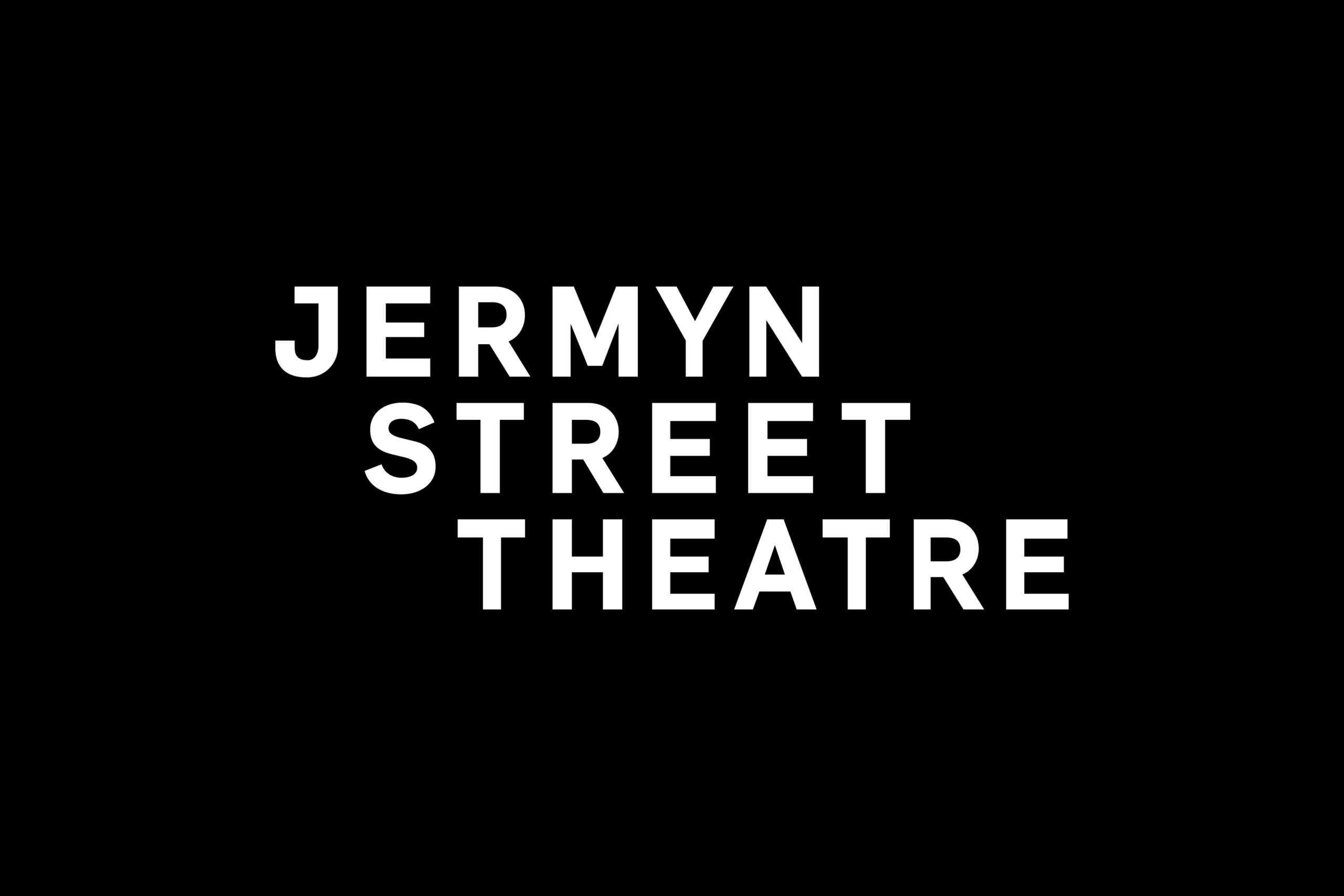
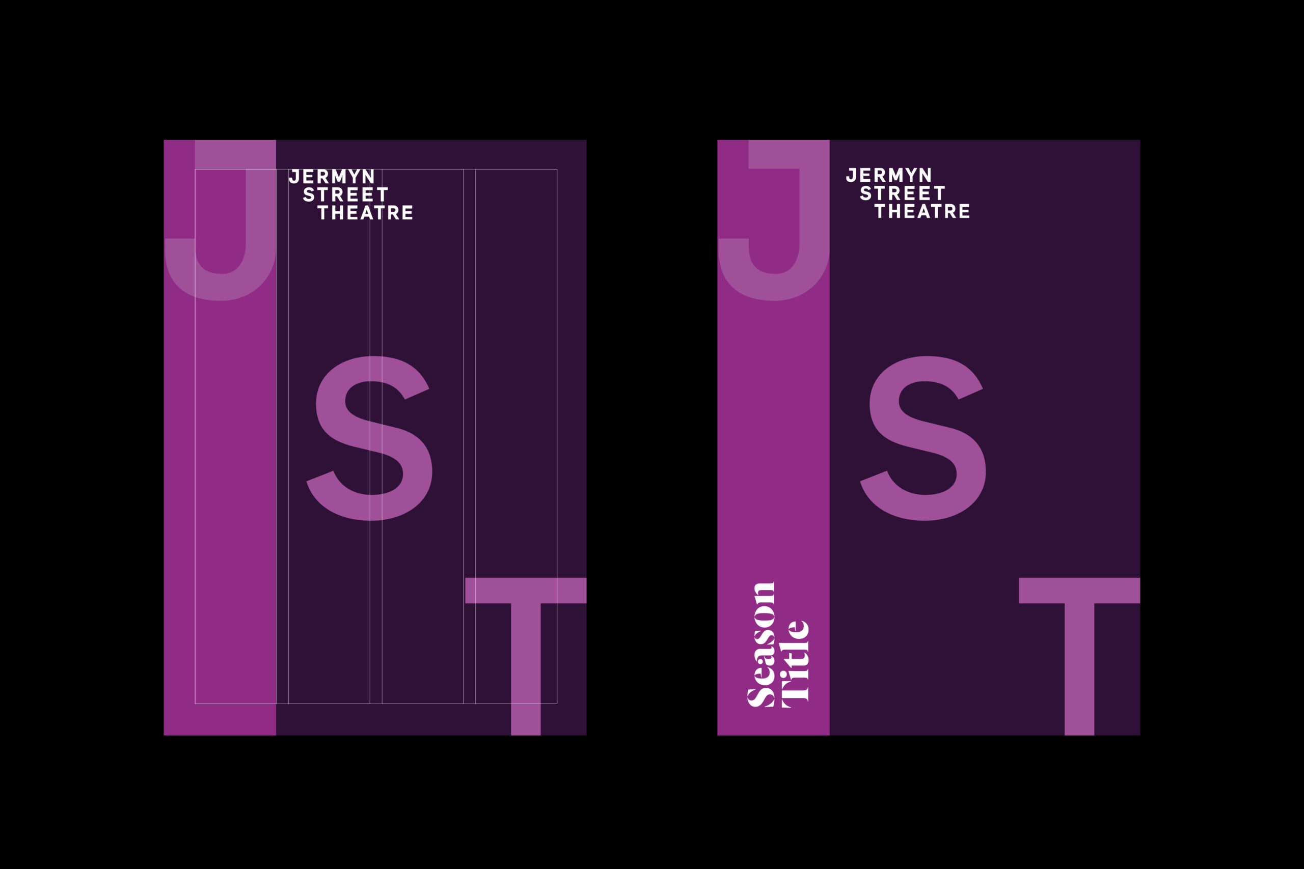
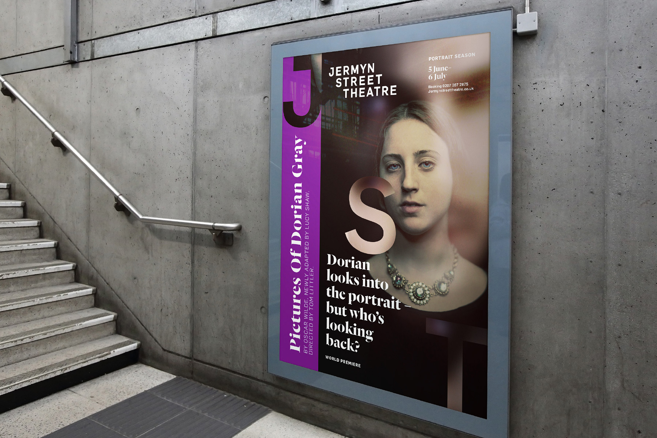
Using this, we developed a stepped custom wordmark, designed to build a sense of drama - leading the audience down to the stage in the theatre below. Then we looked for a unique colour amongst London’s theatre scene. In purple we found a colour that they could own. The oversized JST characters that step diagonally anchor to the edges of the page.
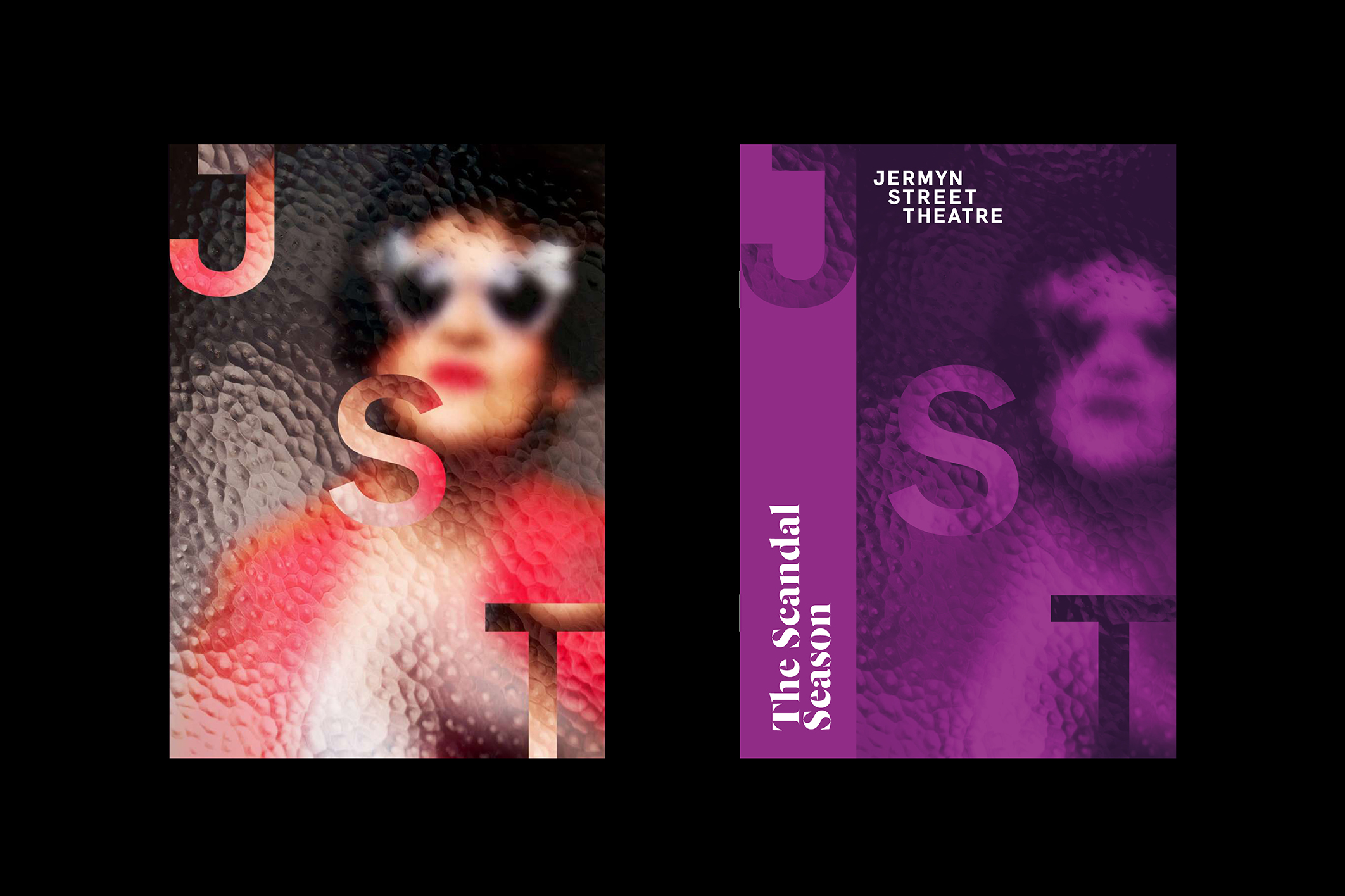
The confined usage references the sense of intimacy audiences experience. Cropping sections of the image into the characters created a sense of drama while acting as a watermark to reflect ownership of each production.
