Shape your world
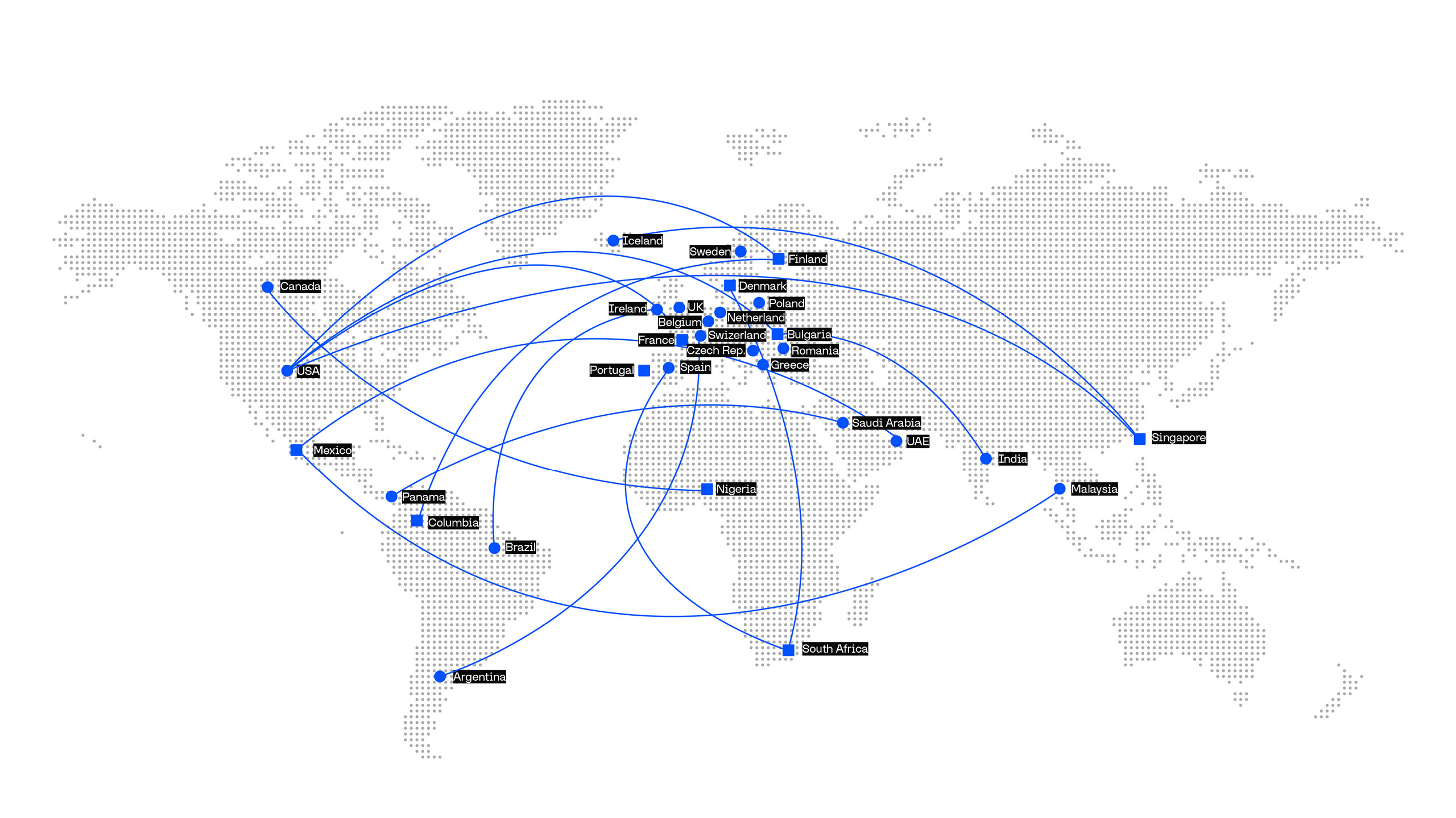
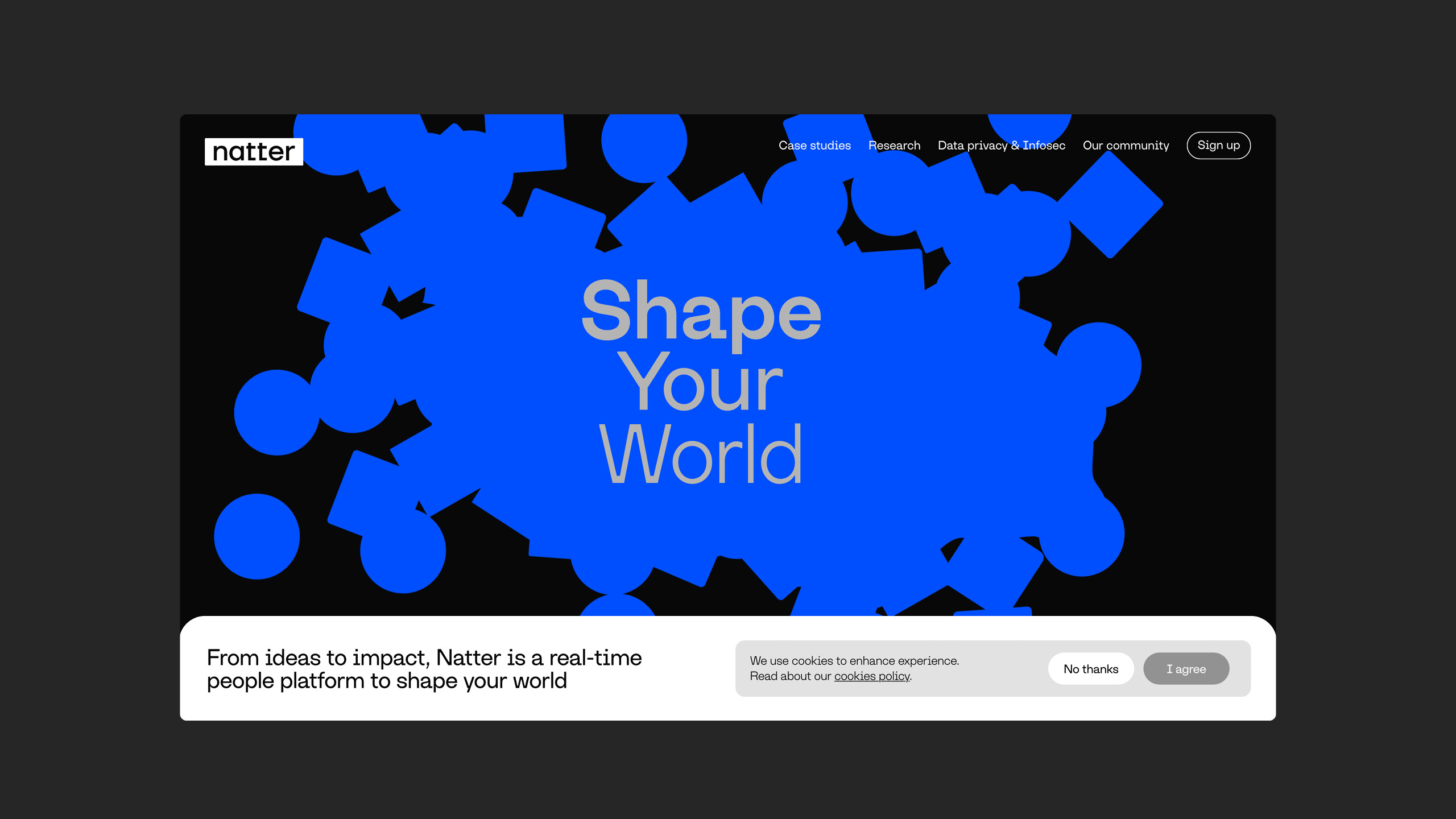
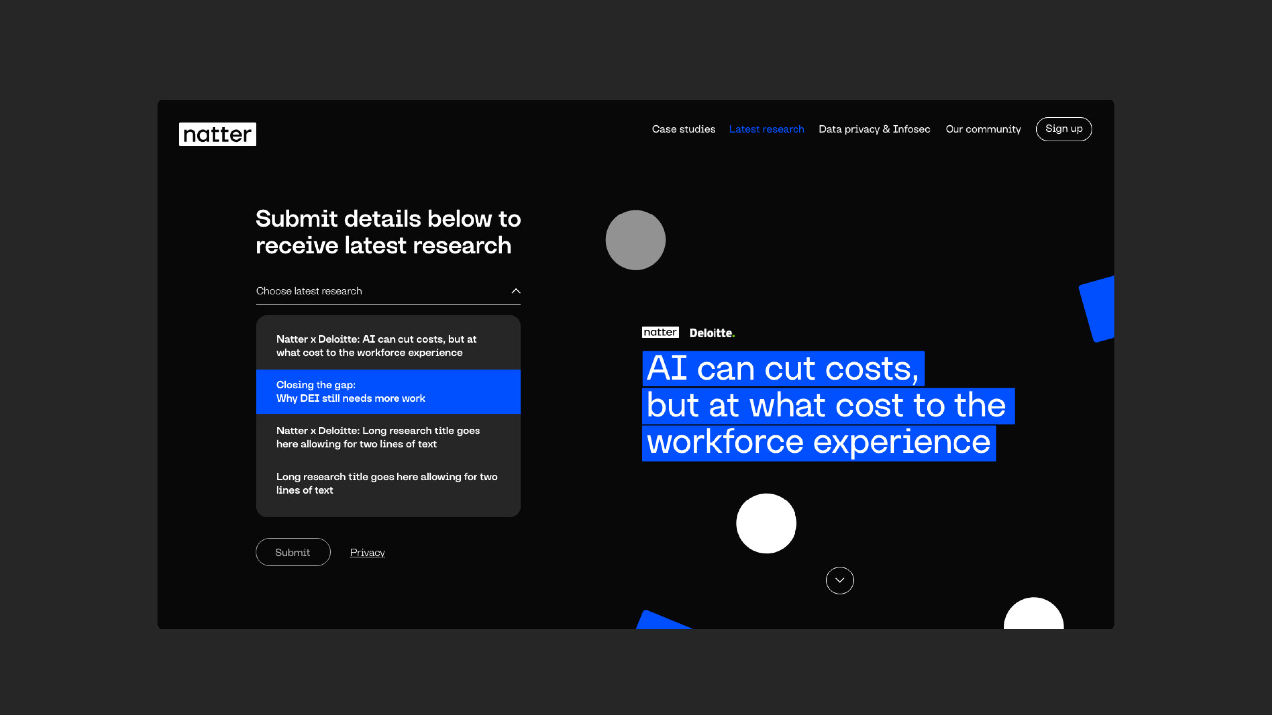
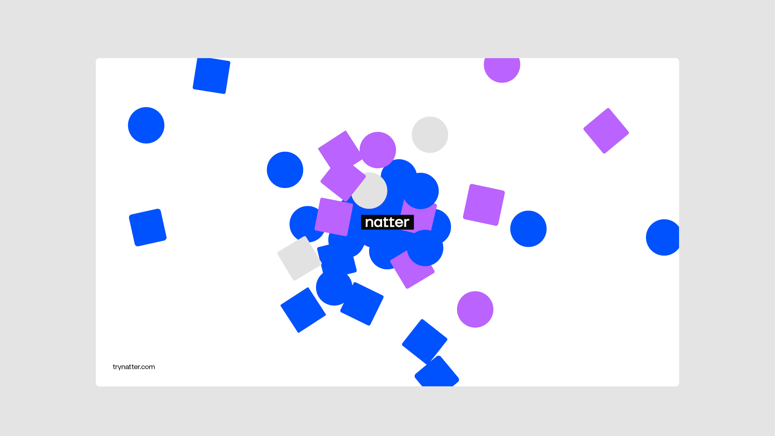
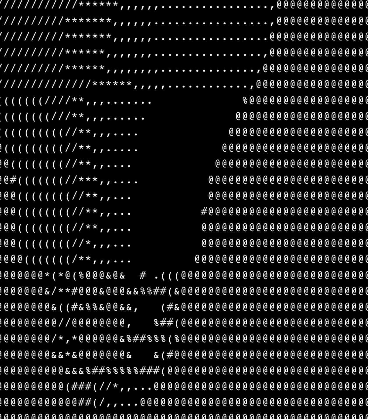
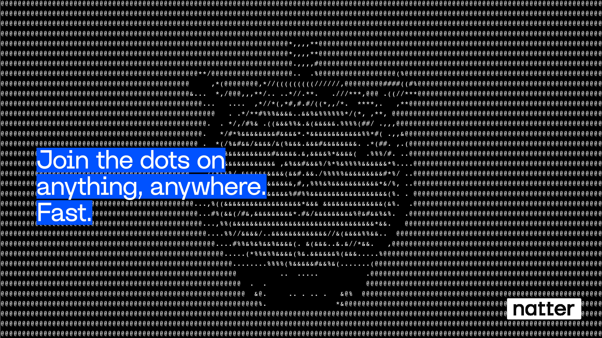
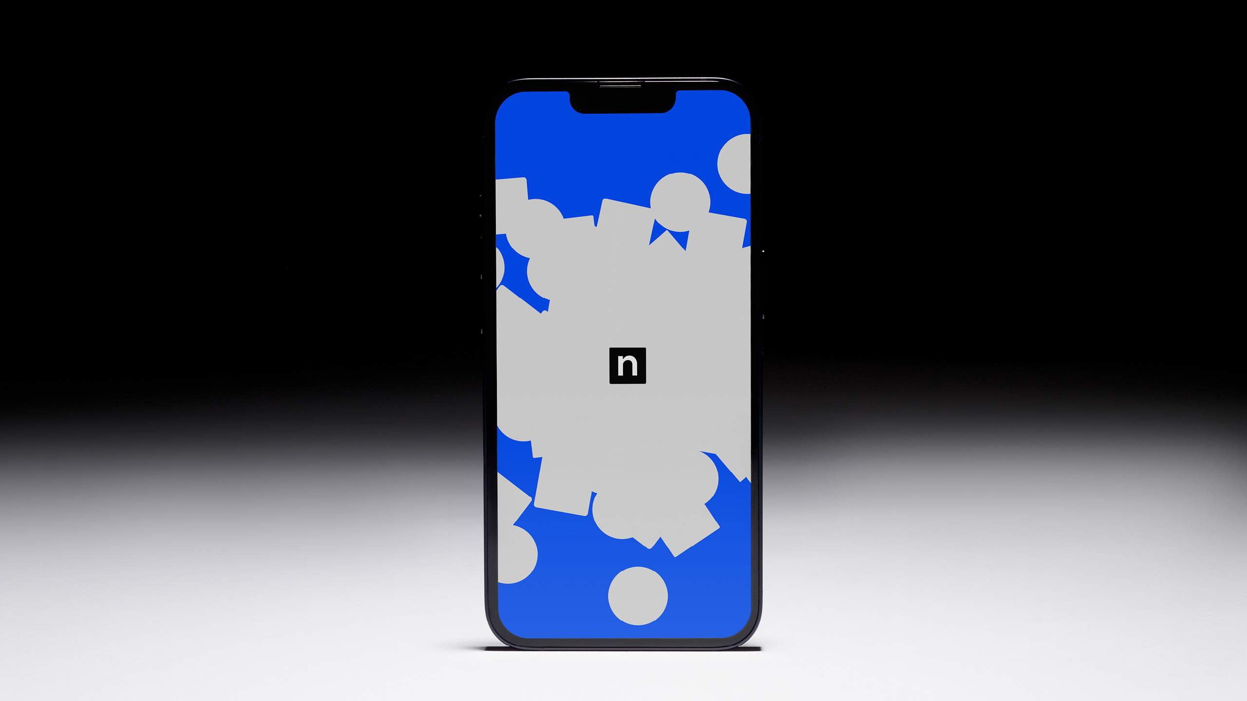
Natter, a start-up created to give everyone a voice. A people-tech business with a product that offers a quick-fire format of one to one video chats for up to 100k people at the same time. With AI summarisation tools in-built, it offers businesses vast opportunities to collect insights at speed and scale. With so many uses identified we built the identity around the brand idea 'Shape your world' and envisaged a visual world that references atoms and electrons, all affected by Natter, the catalyst. Join the dots on anything, anywhere at speed and scale. A people-platform to shape your world. For the wordmark TypeType's Firs Neue offered the perfect similarities to the supporting type but with squared-off tails to the T's. This brought a synergy back to the circle-square visual language. The typeface referencing typed transcripts was chosen for its contrast and its styling that feels like it's been typed, was fitting for the platforms features and benfits. A visual system rooted in language – highlights and underlines are used to add contrast and character and reference the summarisational tools embedded in the platform. Using ASCII code we created a campaign made from language, using the variation in the character set to create shape and form. In a sea of tech-sameness, a boldly distinctive and category-unexpected brand identity that has the simplicity and flexibility to keep growing with them. 4 years later and through continued support led them to secure a $23 million Series A funding round for the next stage of growth.