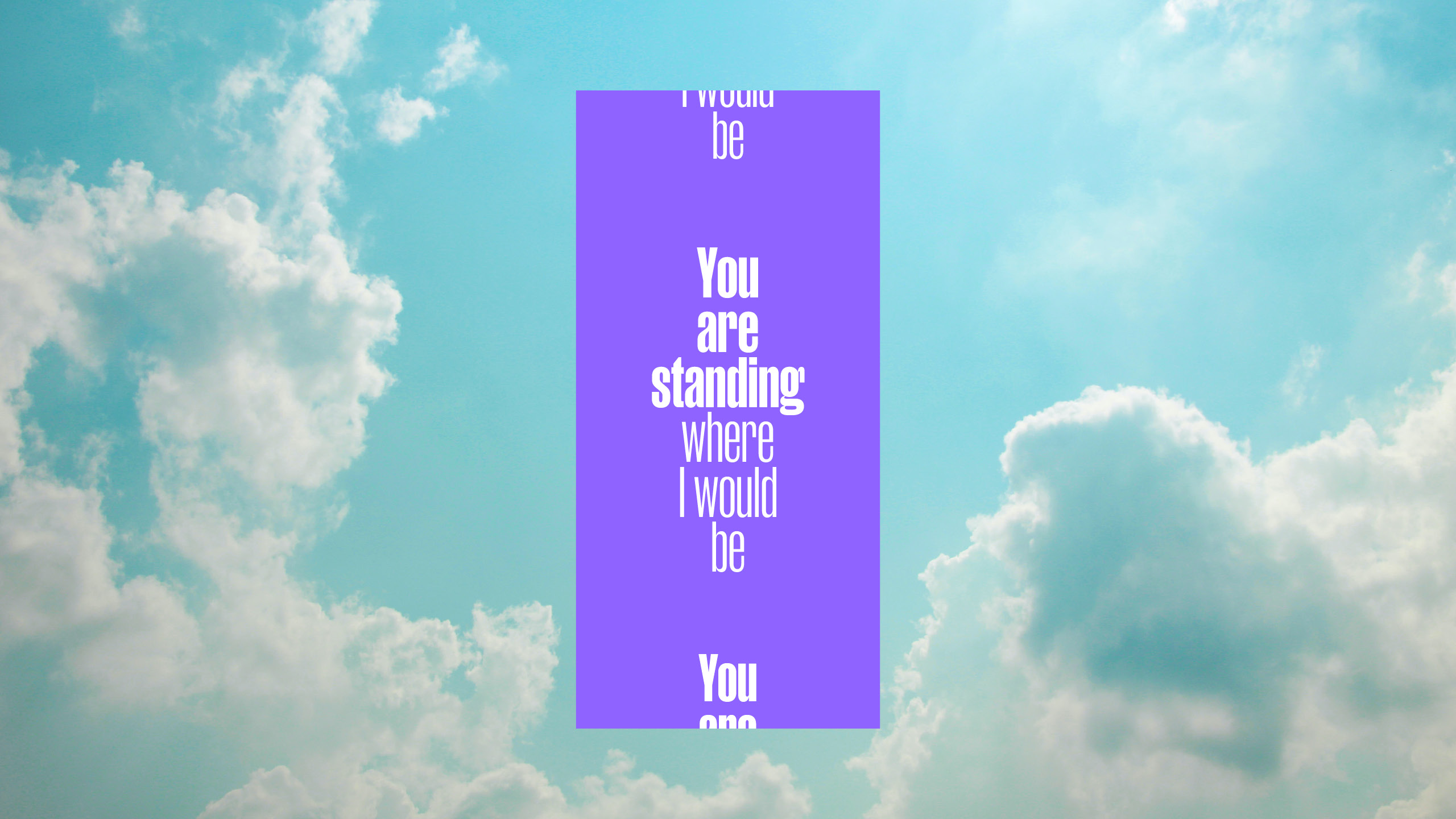
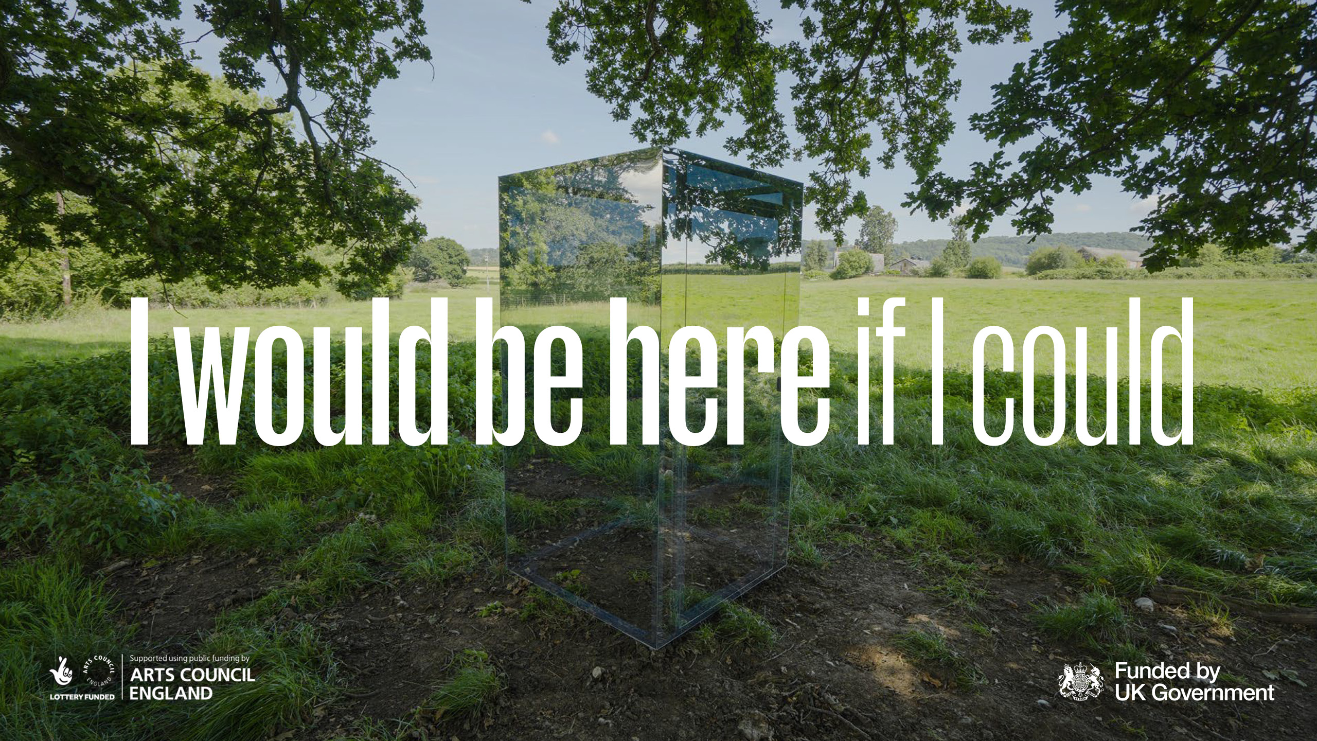
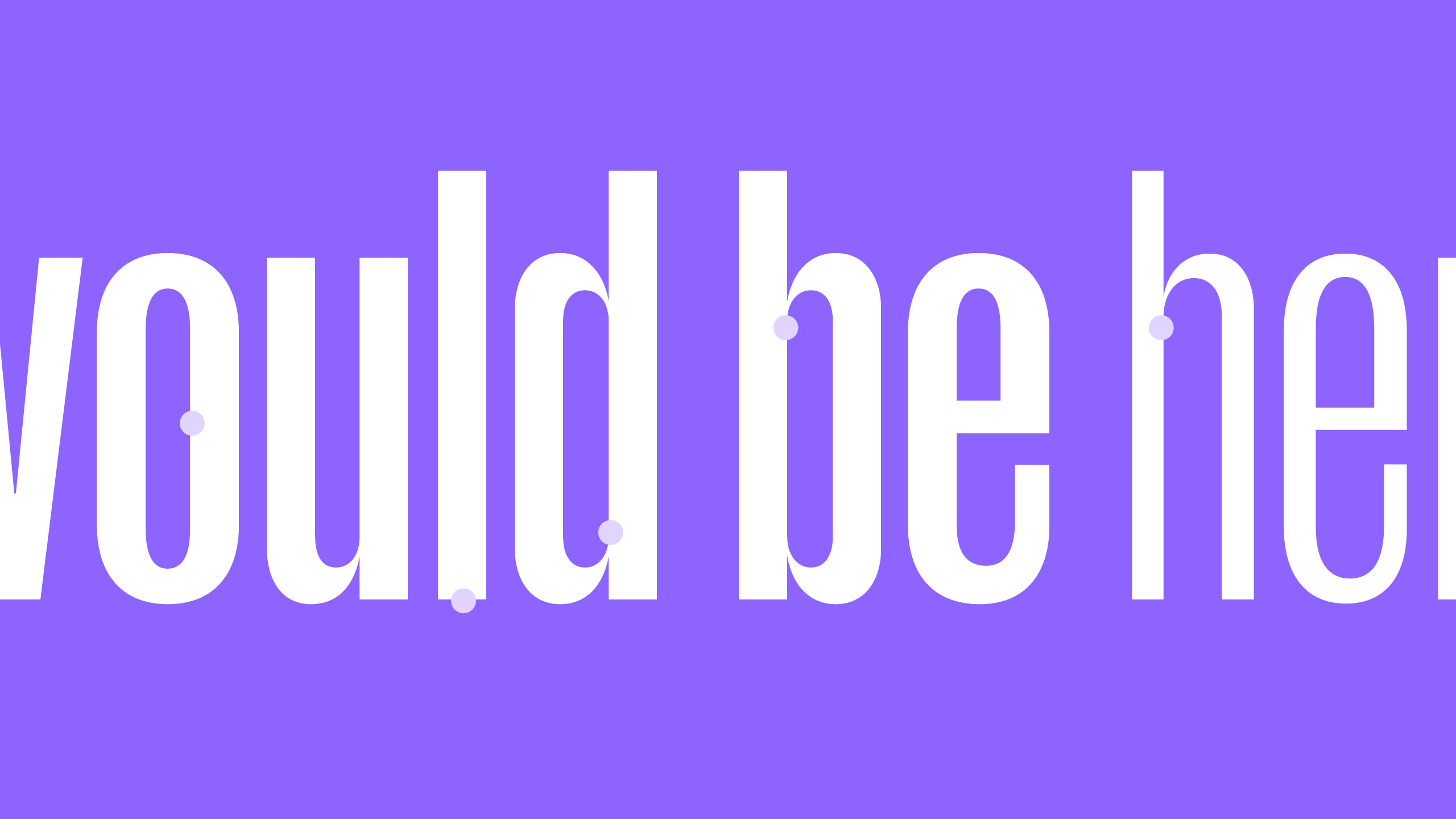
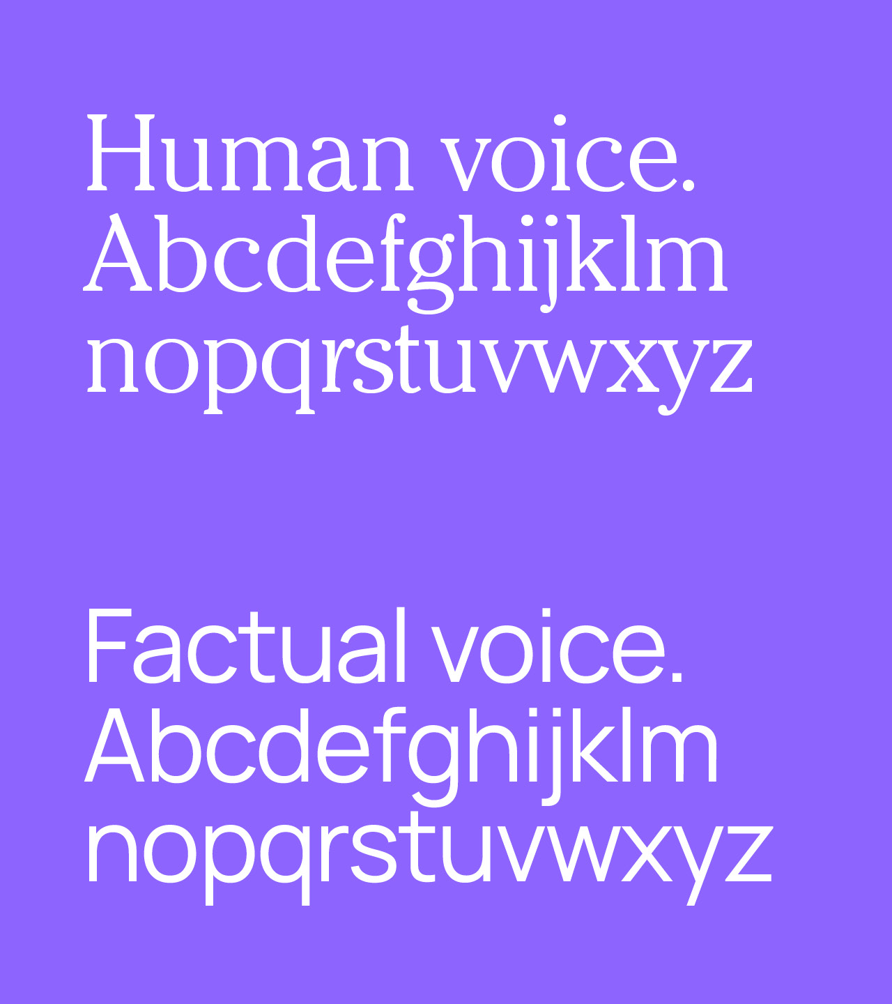
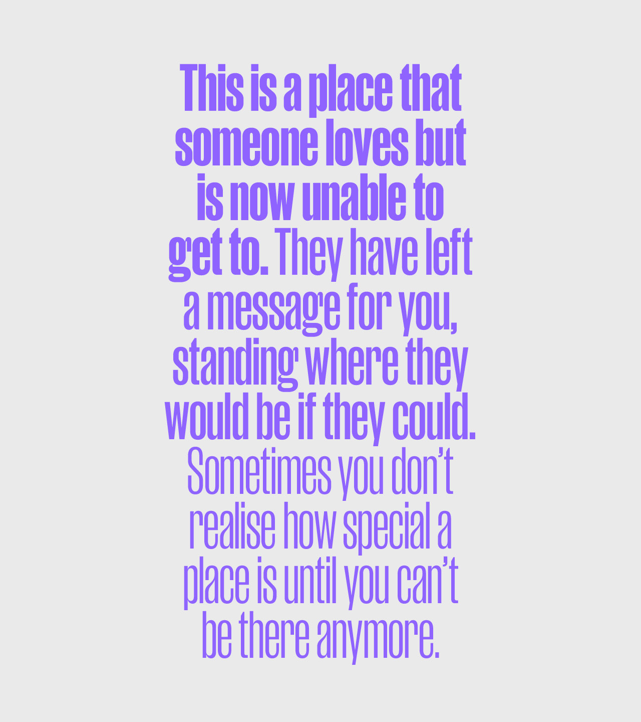
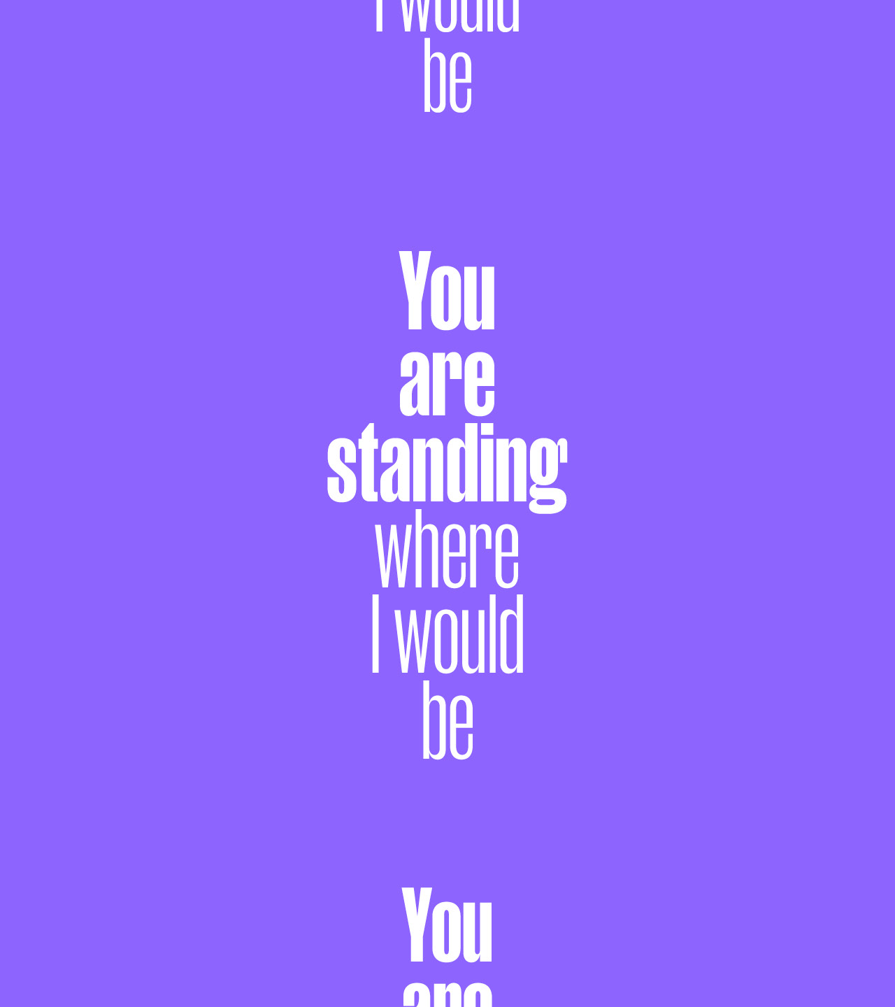
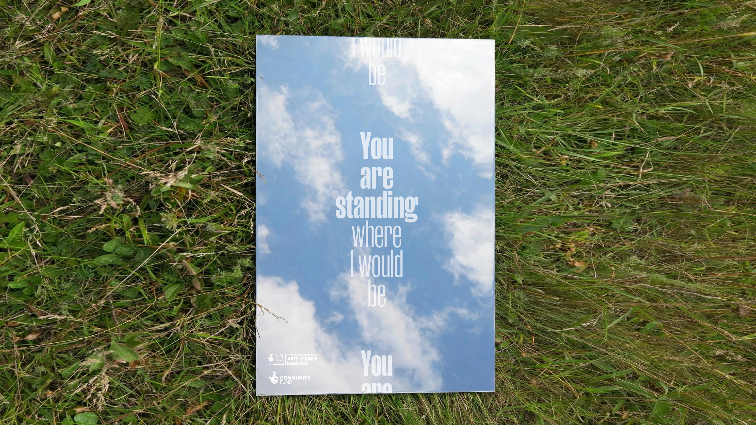
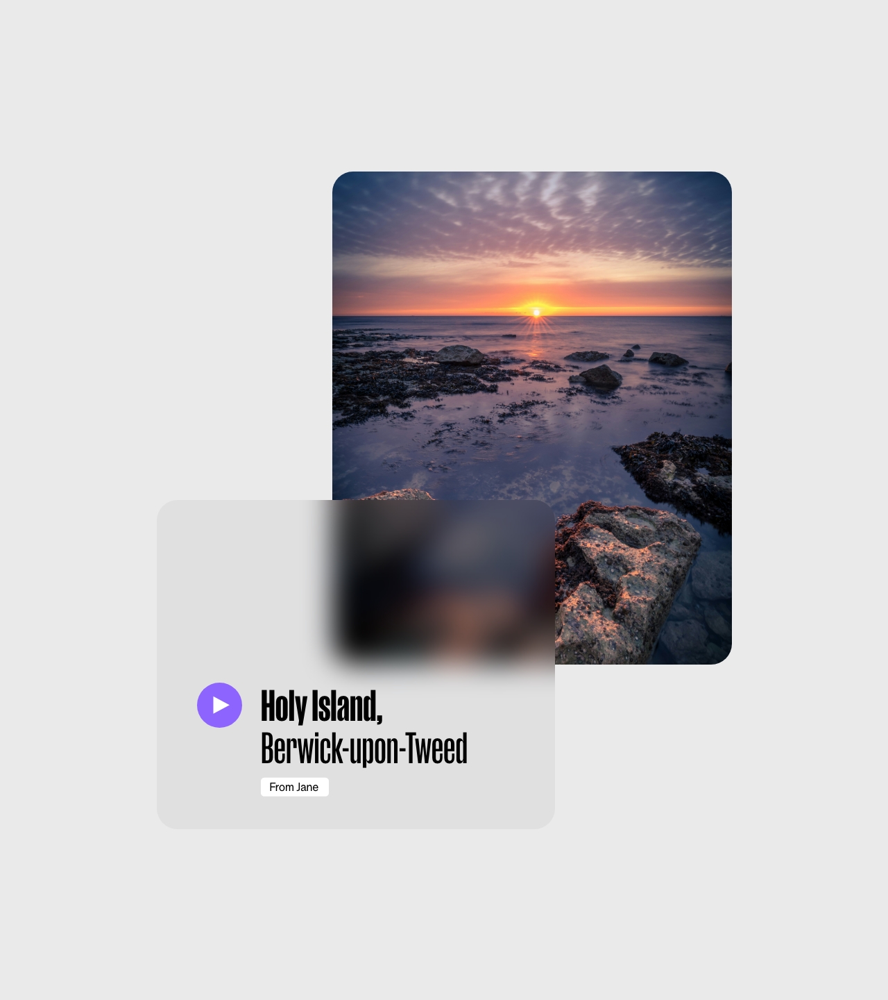
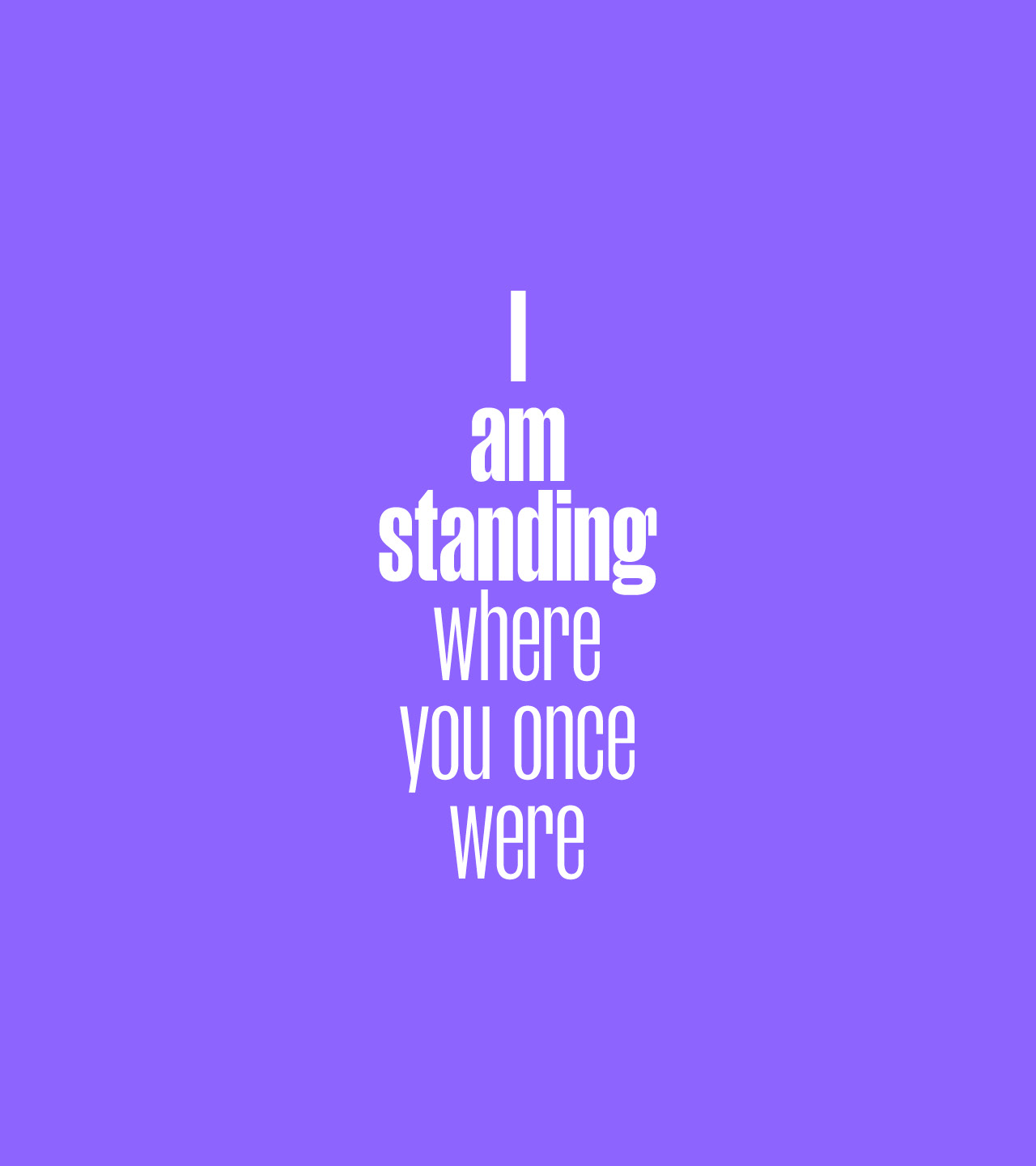
1.5 million people are missing from society in the UK alone due to ME and long covid. Most are bed-bound and can only imagine getting back to the places they love and hold in their mind. An ambitious project that exists to amplify the absence whilst aiming to reconnect them to the places they long for most. The identity explores the concepts of time and space. Bold and condensed, typography forms the base of the identity. Bold and condensed, we used typography to amplify the absence typography forms the base of the identity. Klim's Manuka font with its bold and delicate weights was chosen for humanistic characteristis, the tall characters representing the self and the fragility of life. The title of the work was set in diminishing weights of the font - drawing comparisons to memories, physical presecence of the body itself. Using glass effect overlays over location imagery we could play with time and space to represent the shifting physicalities and memories of those absent from society. Monolithic stacked messaging expressing more human-like characteristics aim to help you see what someone once saw. Repetition communicates the scale of those absent. An invitation to share. Strategy bynada.co.uk