
Every house a home
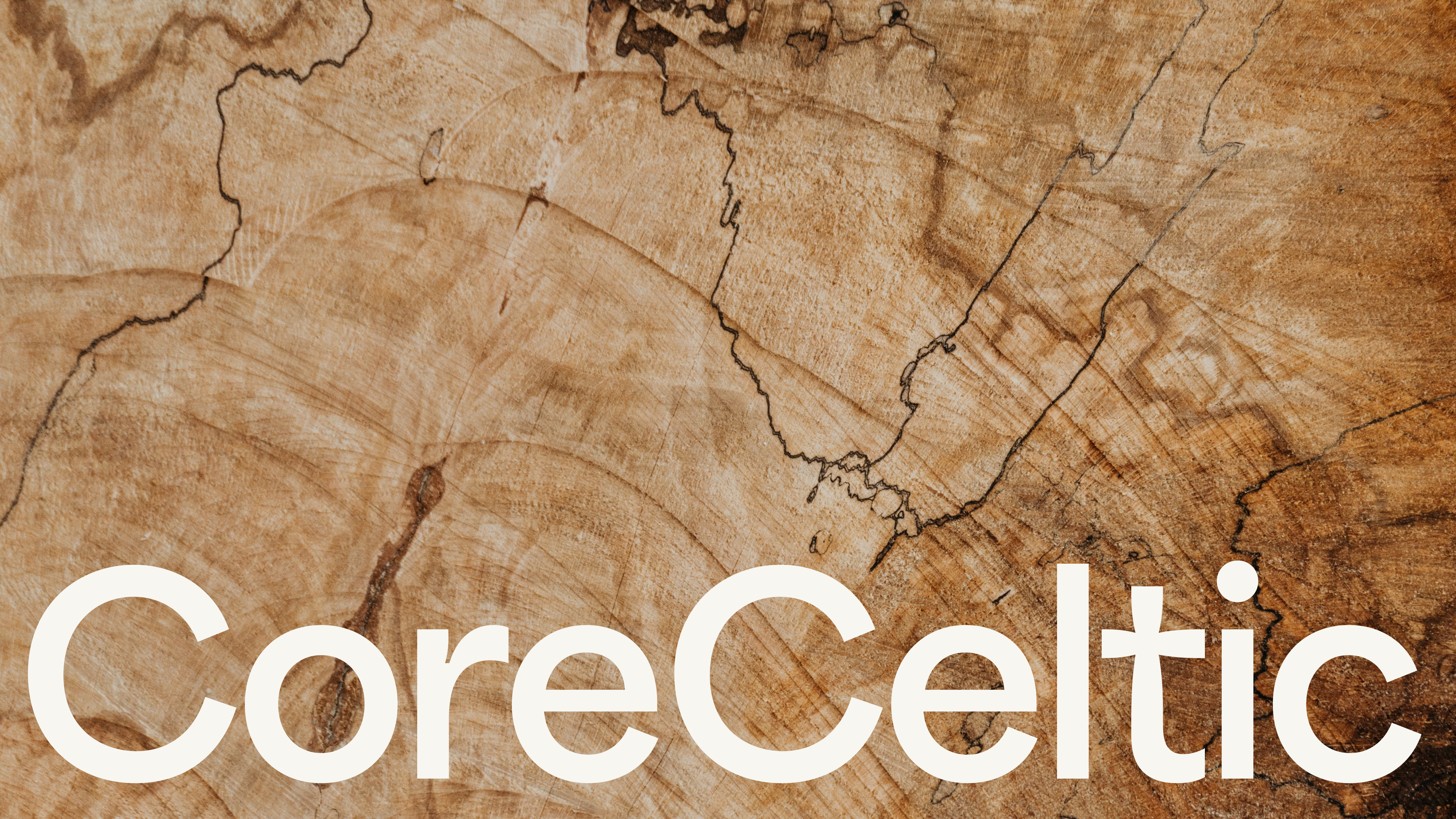
With the construction industry having a bad repution and nearly everyone having heard of a horror story CoreCeltic stand for something different – a busineess that understands your house is more than that — it's a home. They work with integrity, commitment and quality. 'Every house a home' a sentiment which guides their approach to every project. The result is an identity that blends modernity with classic values. Different but reassuring. The wordmark provides a subtle nod to heritage through the celtic cross in the letter T.


